Craigslist App Redesign:

Craigslist is an application that allows users to search and share content globally. As one of the most popular classified ads sites in the world, users are able to explore different sections of jobs, housing, for sale, items wanted, services, community service, gigs, resumes, and discussion forums.
Date: Dec. 2022
My Role: UX Researcher, UI/ UX Designer
Tool: Figma, Google Doc
Duration: 2 Weeks
The Problem
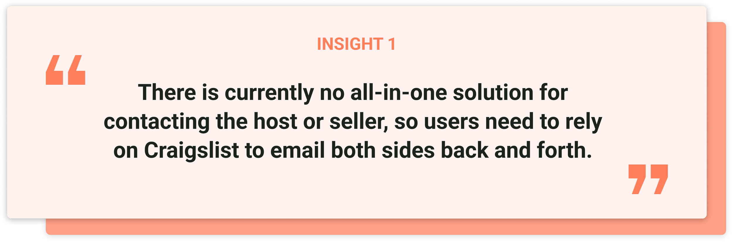
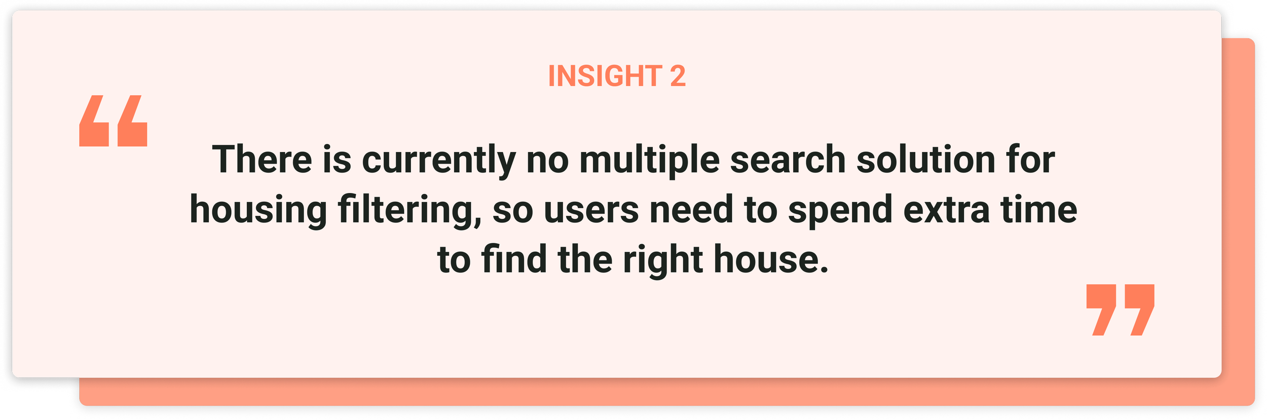
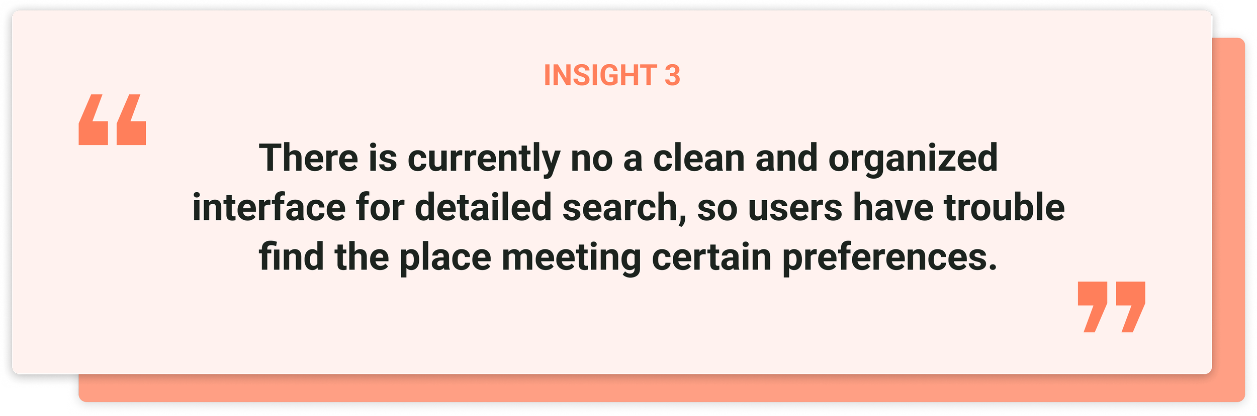
Although Craigslist has been widely used since its launch in 1995, it has also received a lot of criticism for its outdated user interface and poor user experience. Users complained that the website was unnecessarily slow and crowded.
Solution & Goals
1. Enhance Craigslist's visual appeal by modernizing the outdated app interface and making it look cleaner and more appealing.
2. Optimize Craigslist's taxonomy and provide a more user-friendly solution to help users more quickly and efficiently achieve their objectives.
-
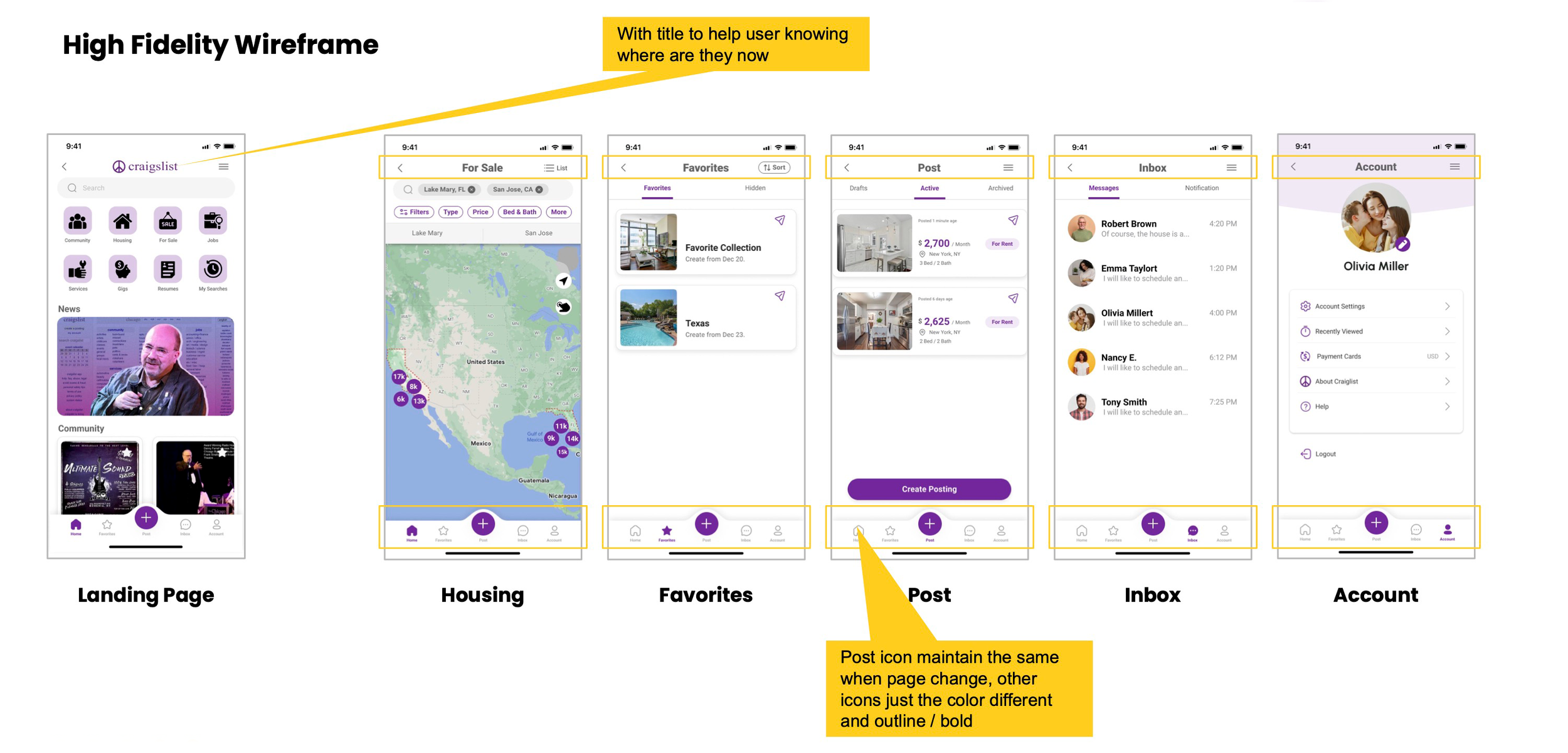
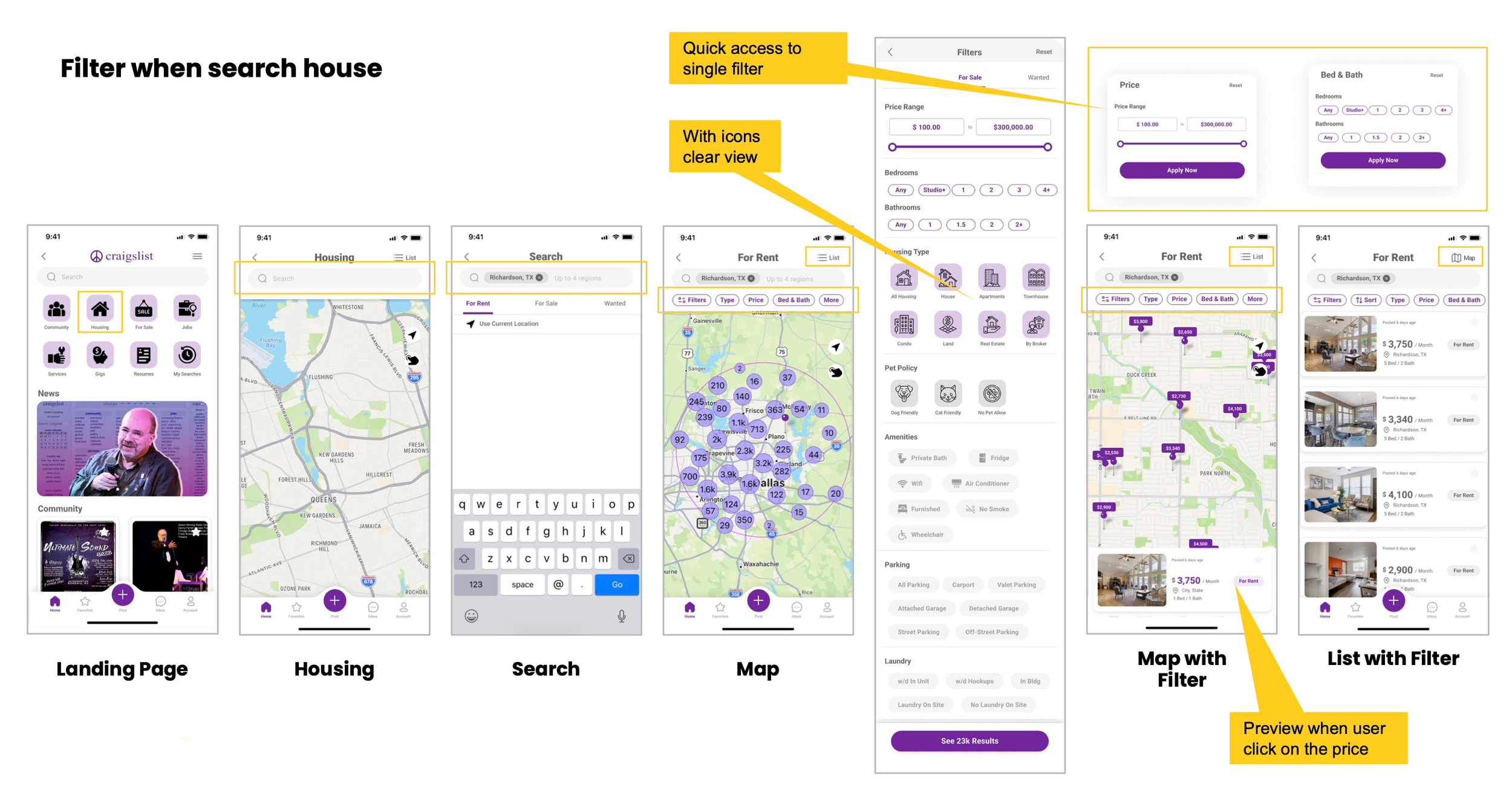
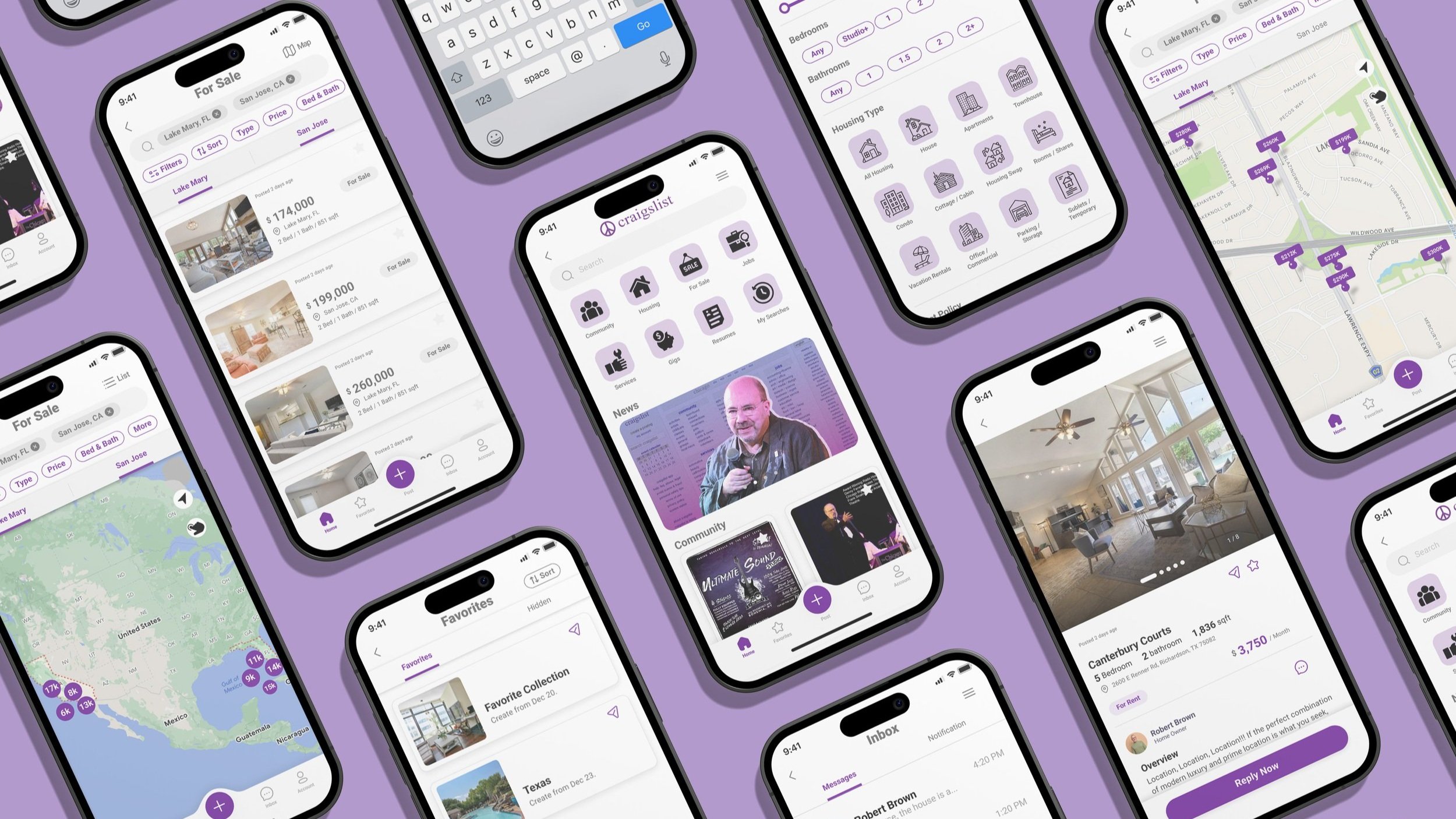
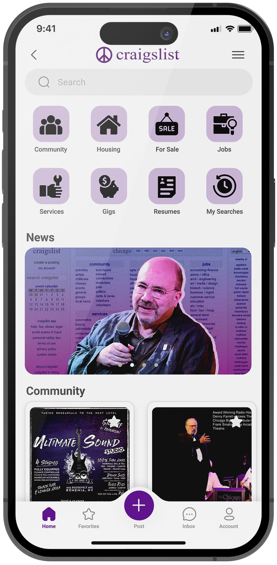
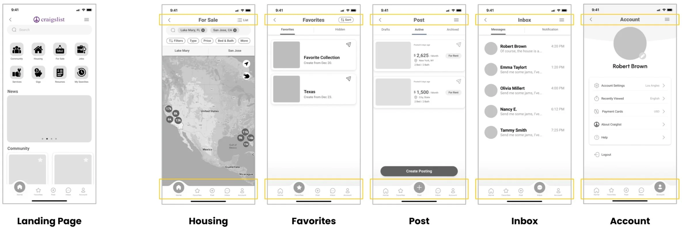
![]()
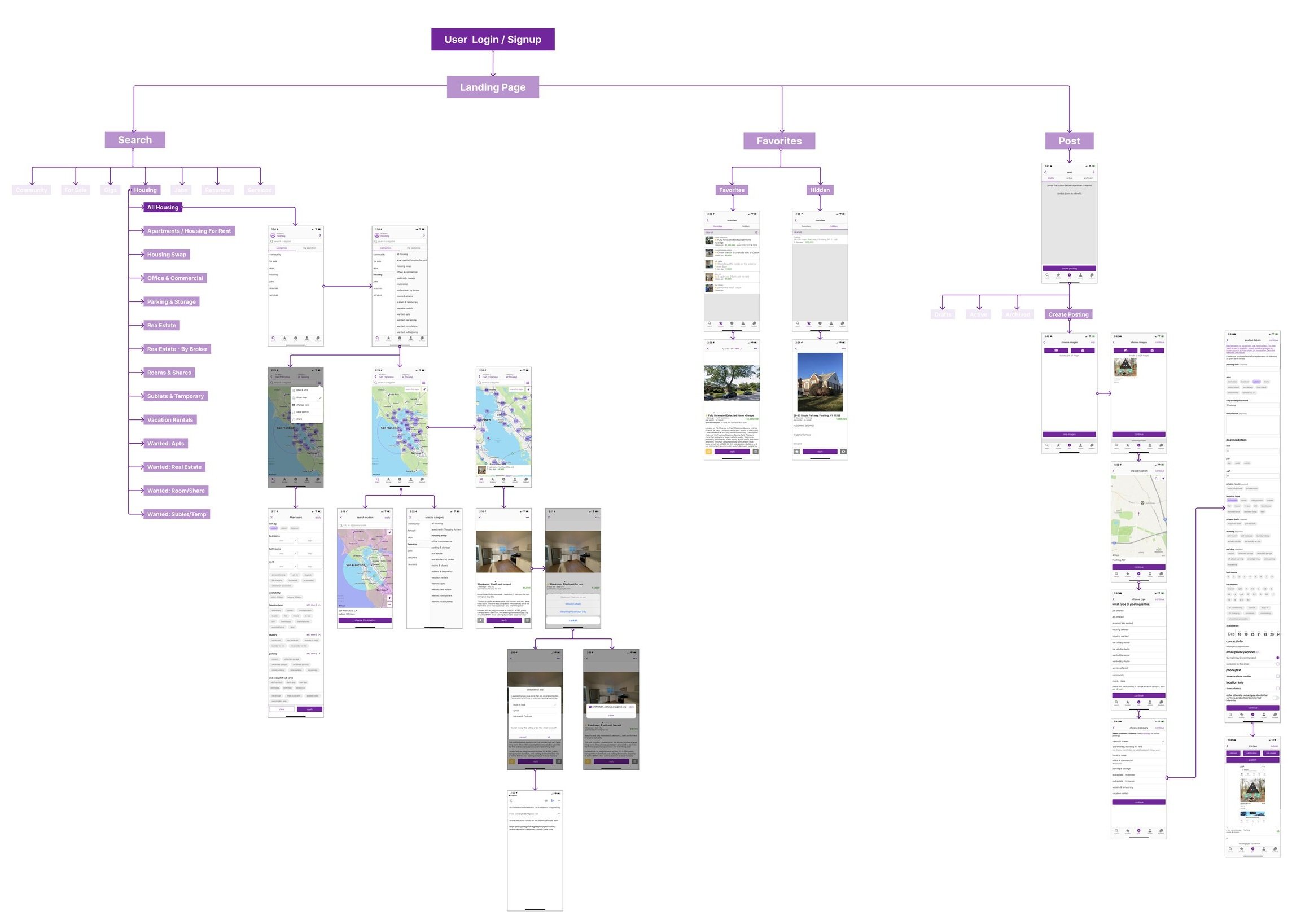
Landing Page
-
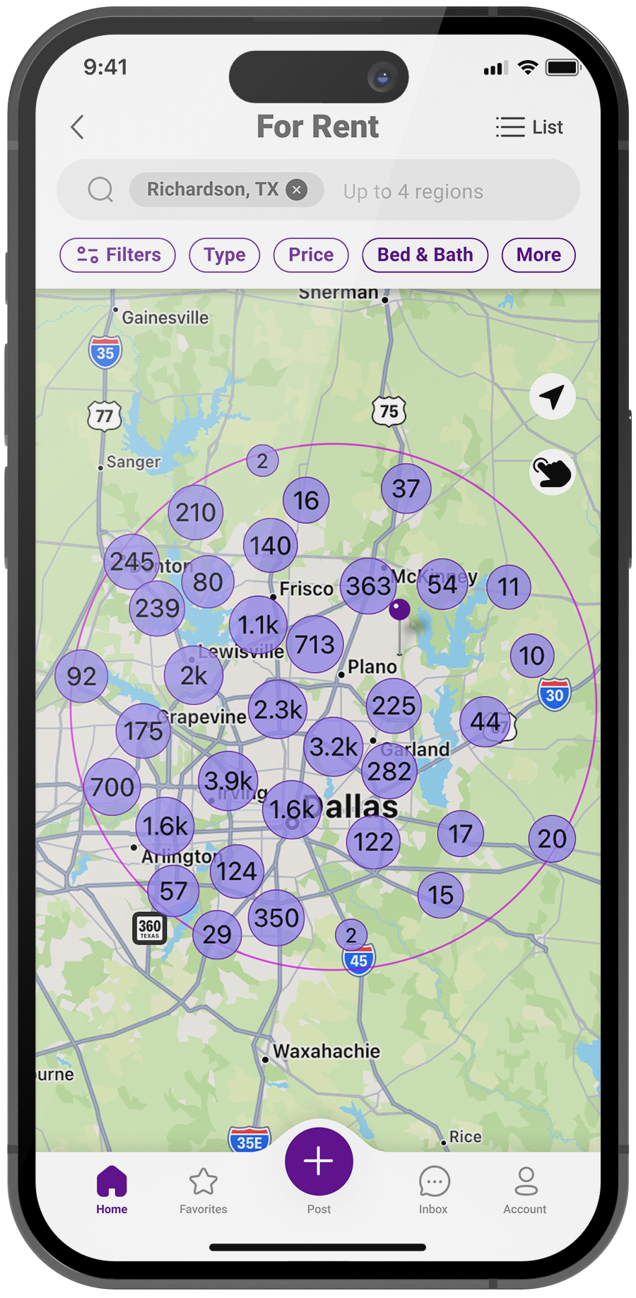
![]()
Housing Search
-
![]()
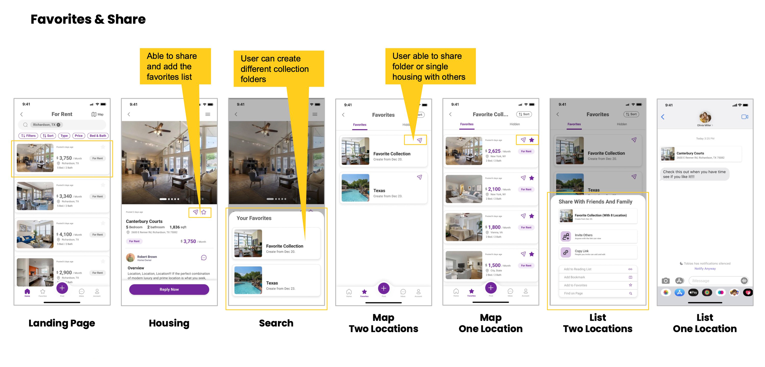
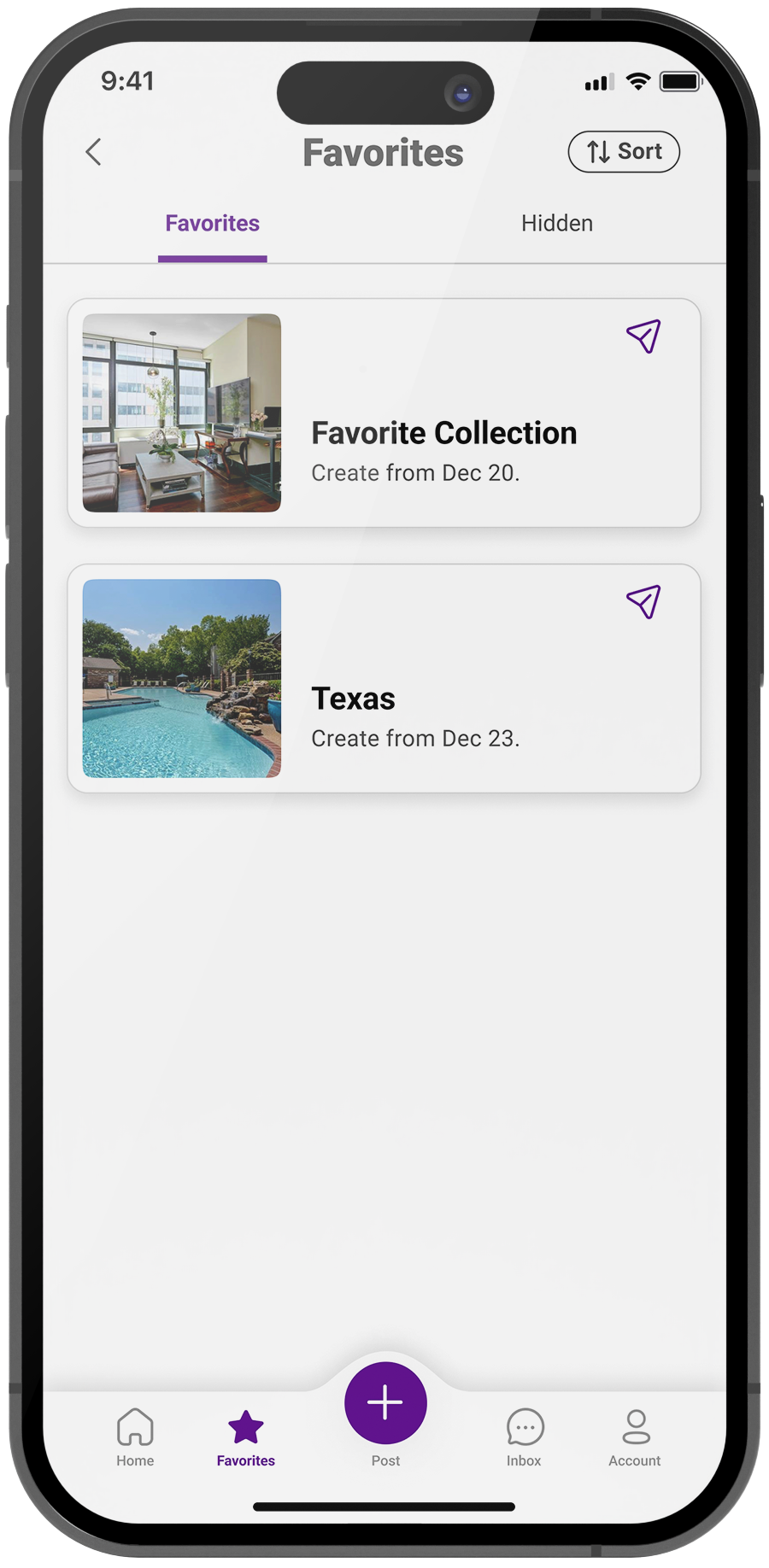
Favorites
-
![]()
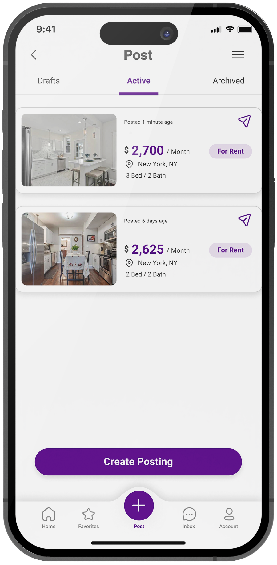
Create Post
-
![]()
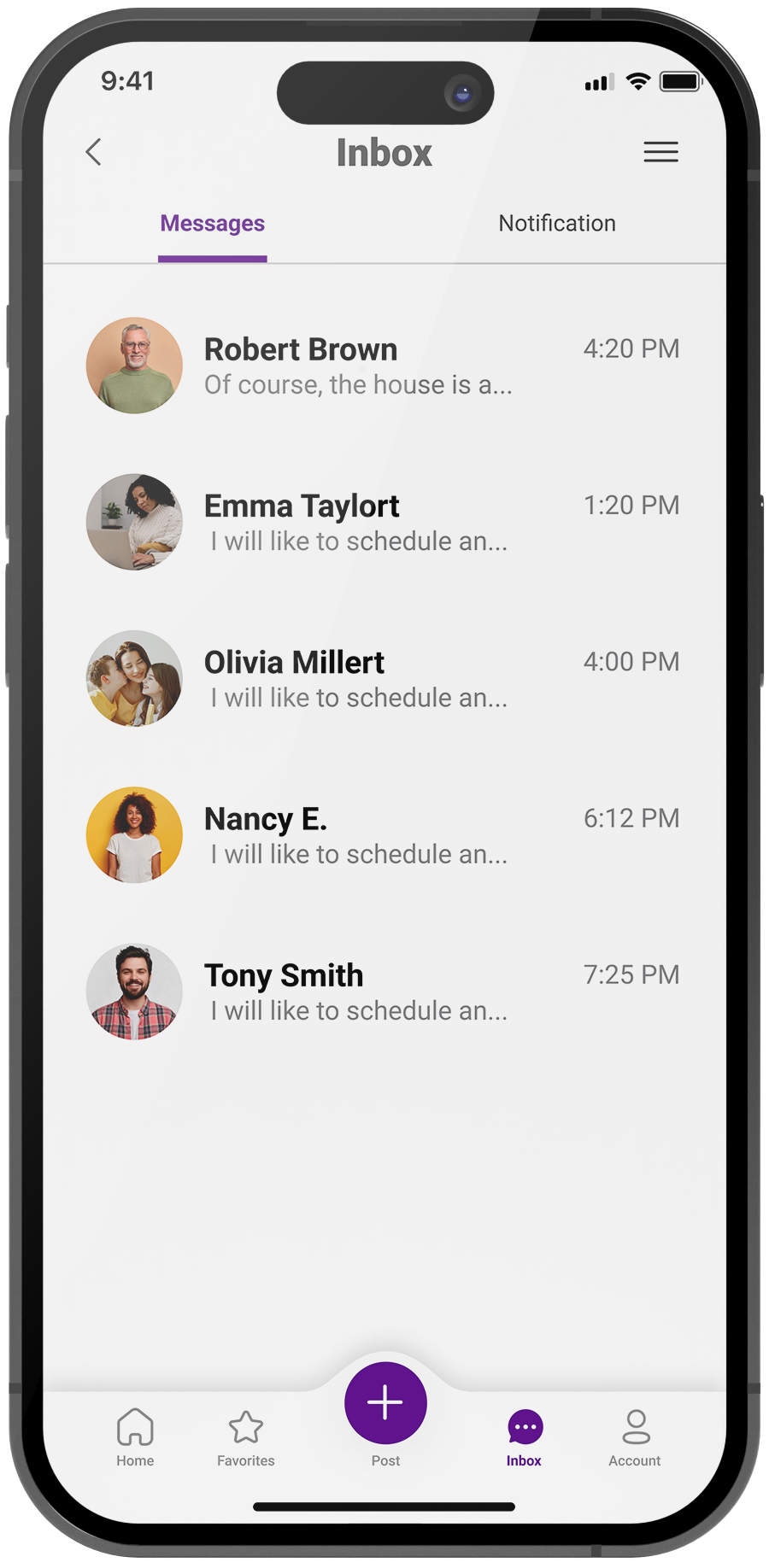
Inbox
-
![]()
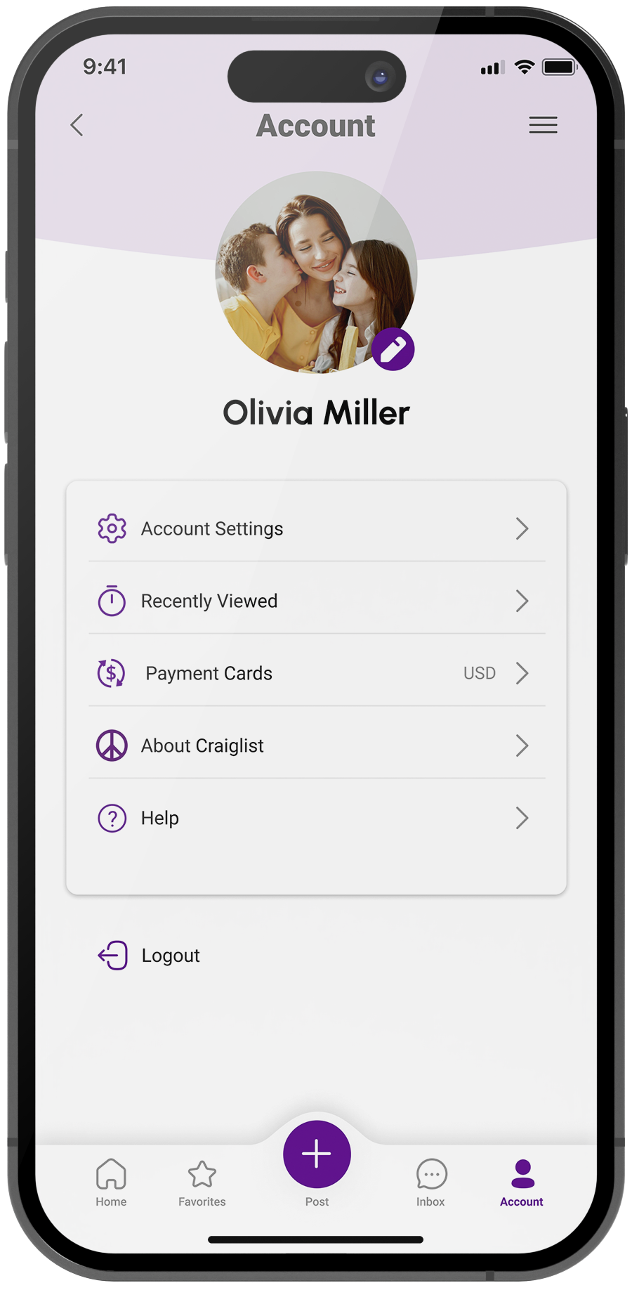
Account
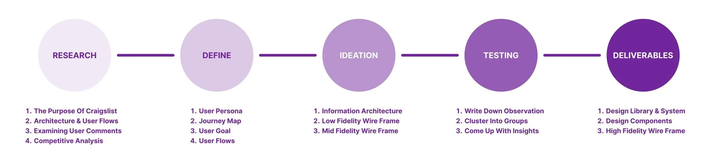
Research
Step 1 The purpose of Craigslist
I started by exploring Craigslist's current features to get a basic understanding of how users would use this platform. I get to know the users more by gathering relevant information about the market and analyzing the purpose of the product.
By learning more about the users' contexts and needs, I can better understand how to design products that meet those needs and ensure they start their journey on the right foot.
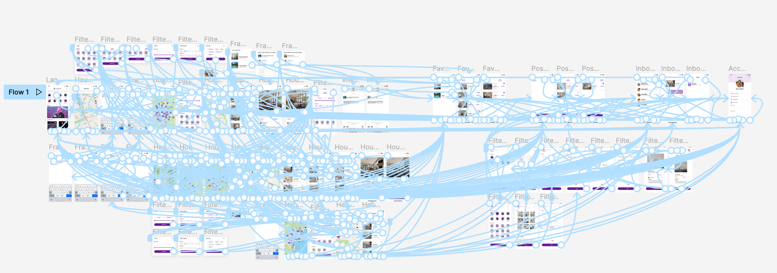
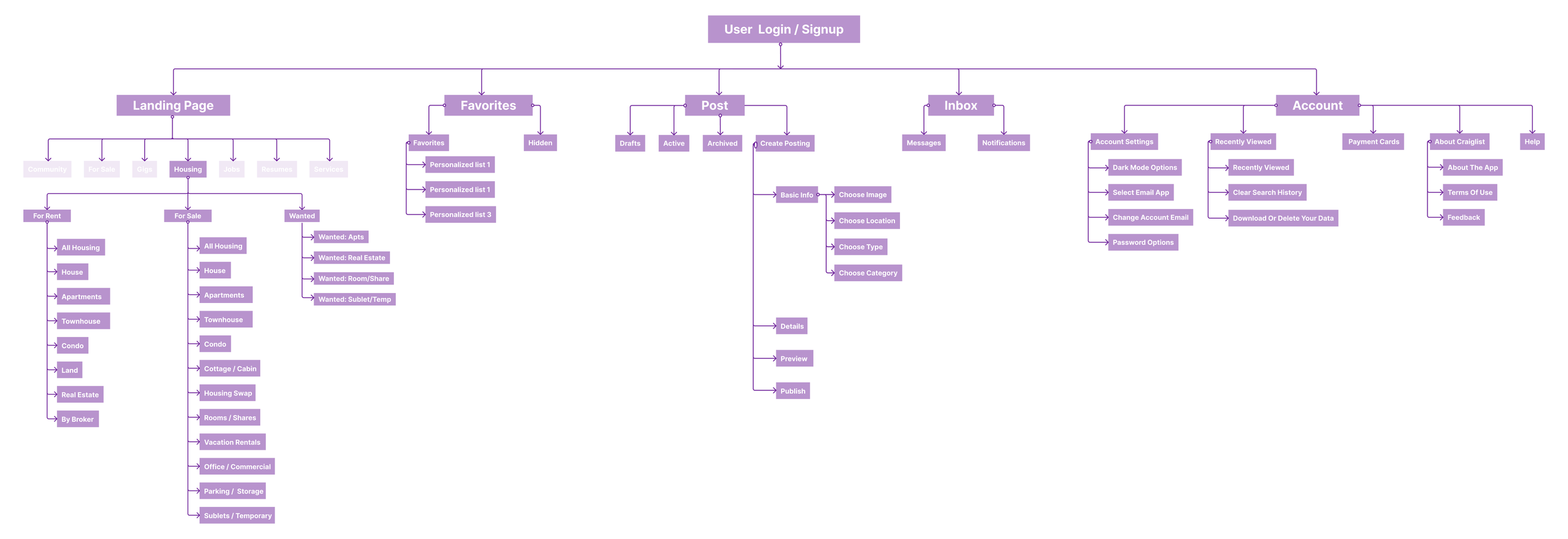
Step 2 Information Architecture and User Flows
Then I define areas that need improvement by studying the current design and architecture, as well as looking at usability concerns between user flows and the user interface.
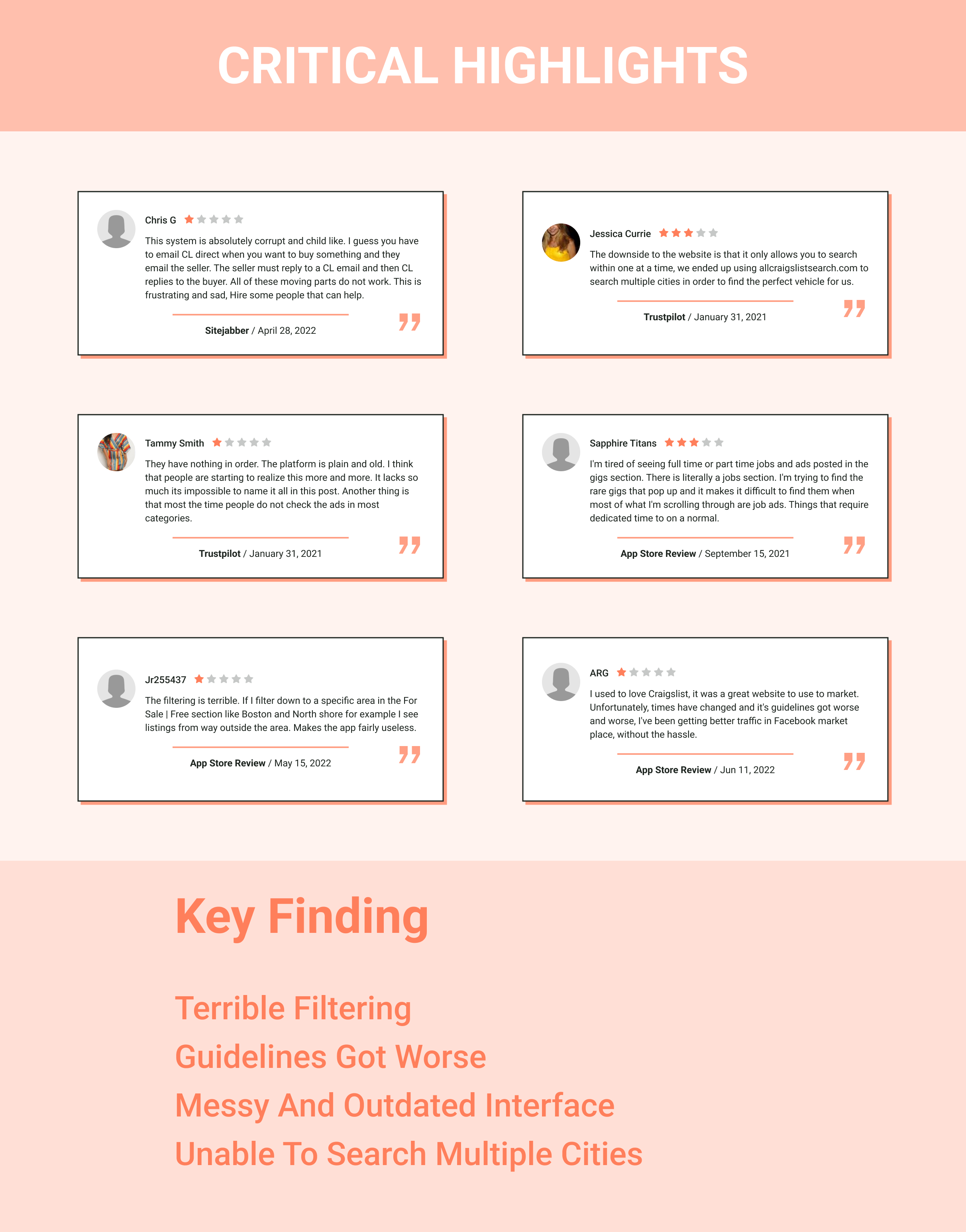
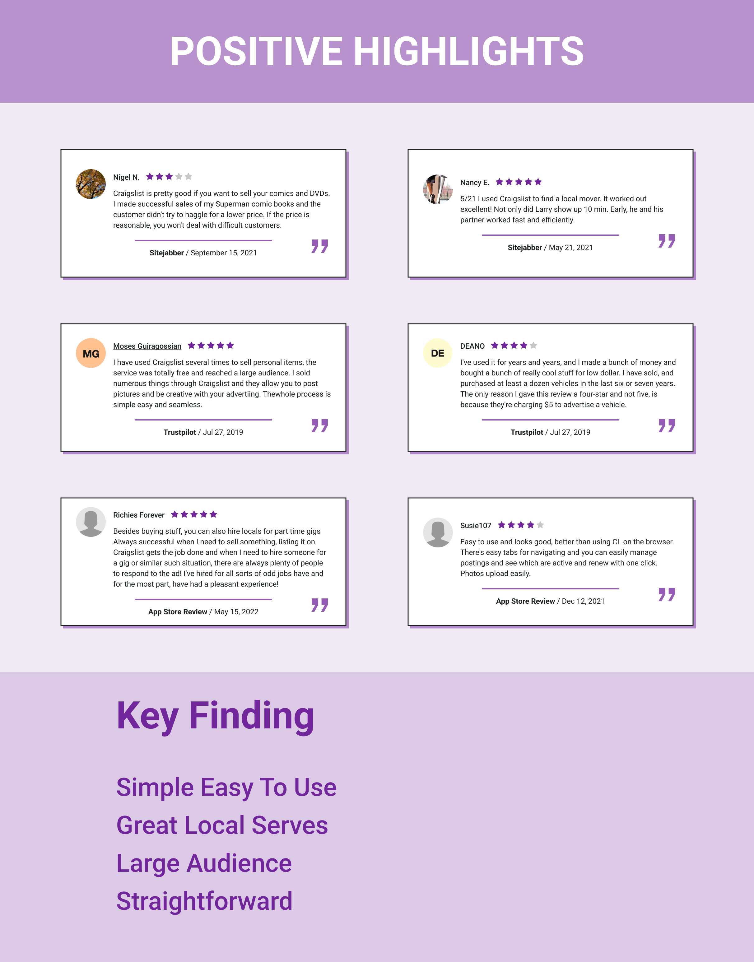
Step 3 Examining user comments
Next, I decided to analyze users based on the available information I have access to, such as the user reviews from the App Store review, Sitejabber, and Trustpilot.
Reading user reviews and complaints not only helps me understand the previous, existing, and potential issues users are facing but also helps me understand user needs and pain points.

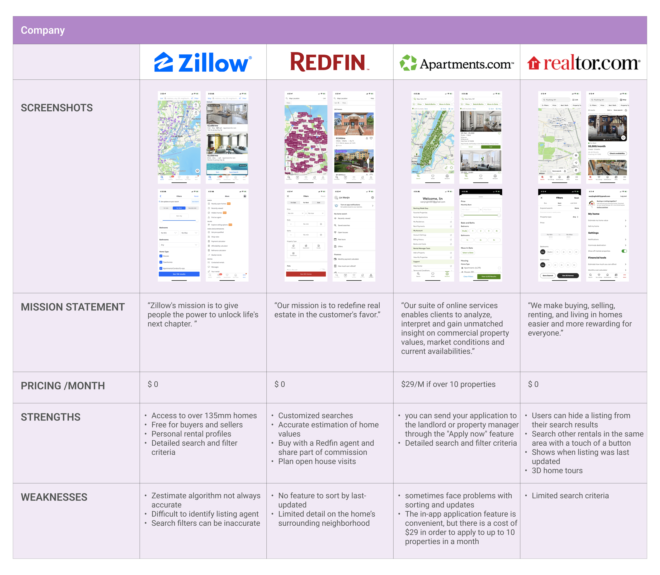
Step 4 Competitive Analysis
Once I understand the product and its users better, it is time to learn about the competitors. This competitive analysis gives a clear picture of where Craigslist stands in relation to its competitors.
At the same time, it provided me with many inspirations from the solutions I discovered throughout my research. It allows me to adapt them to match Craigslist and the target market, improving both the end product and the user experience.
Define
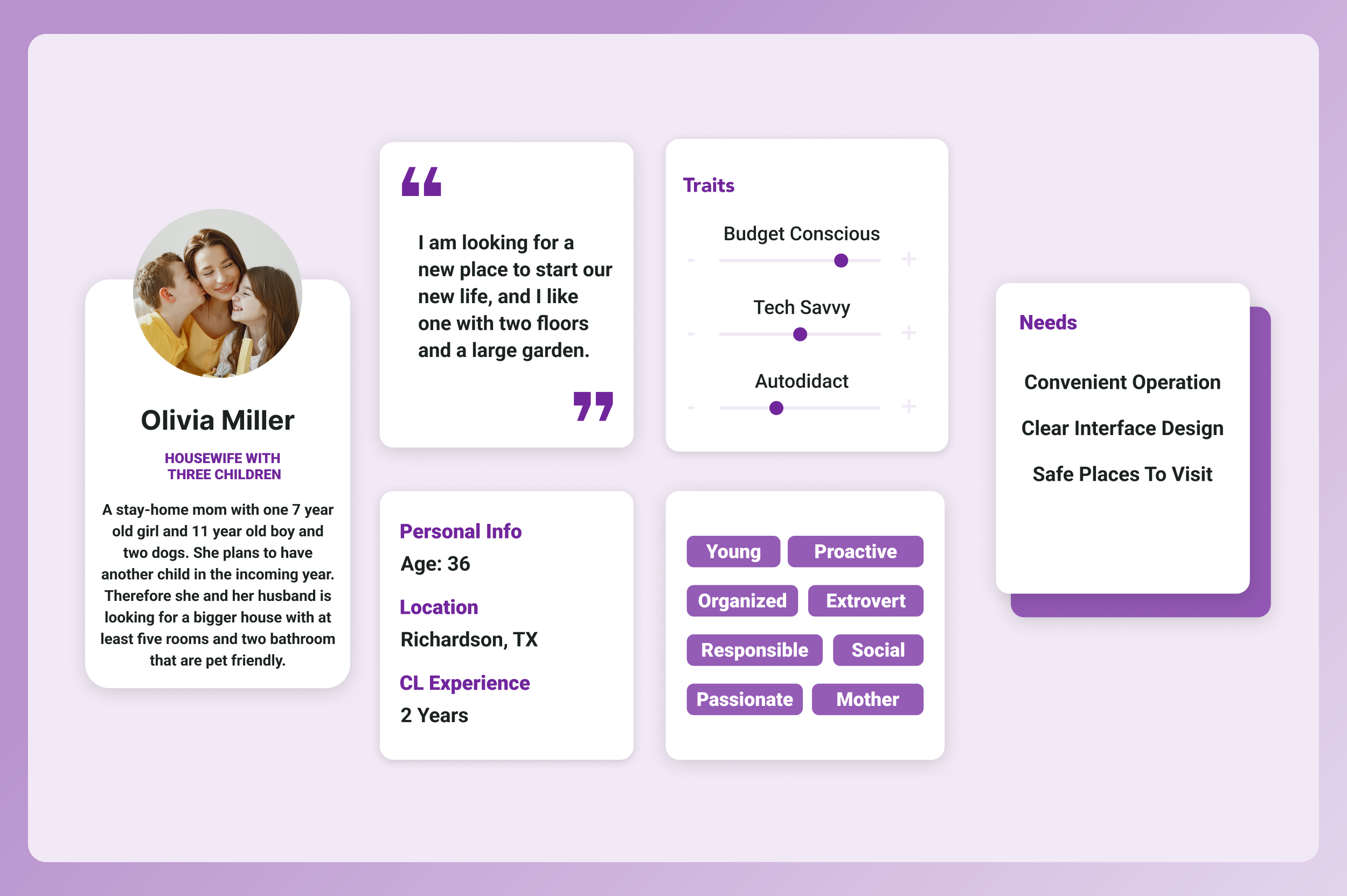
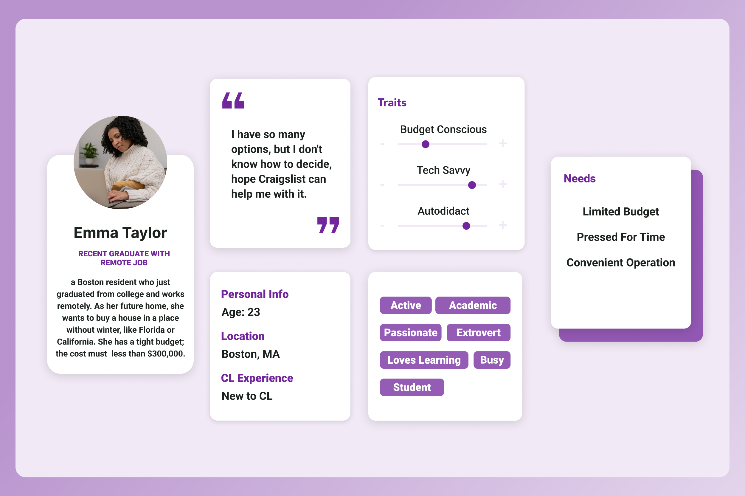
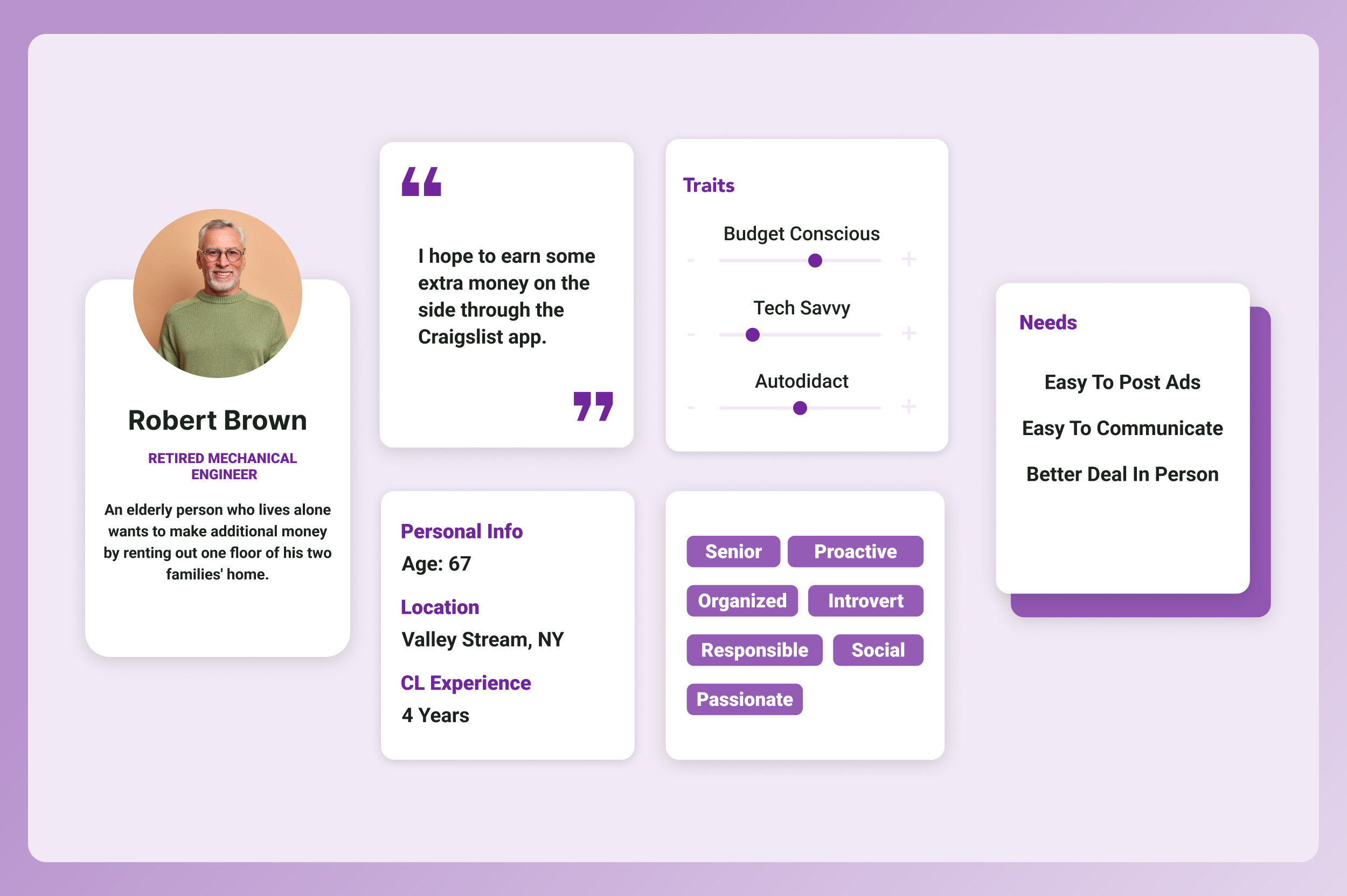
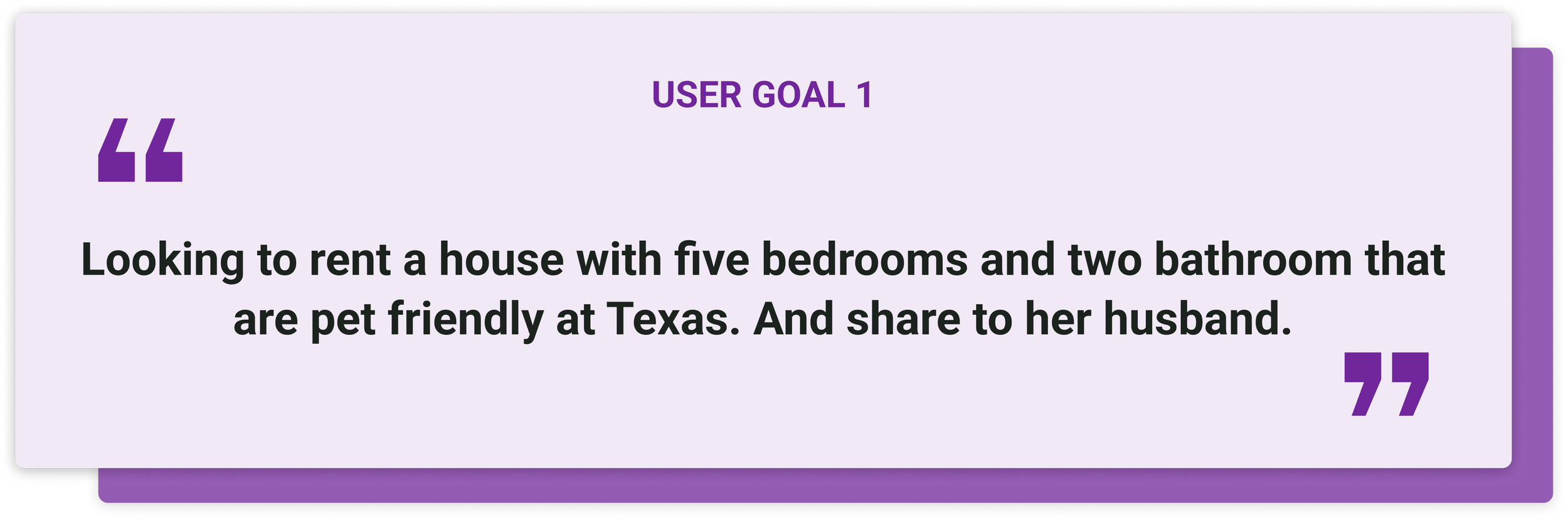
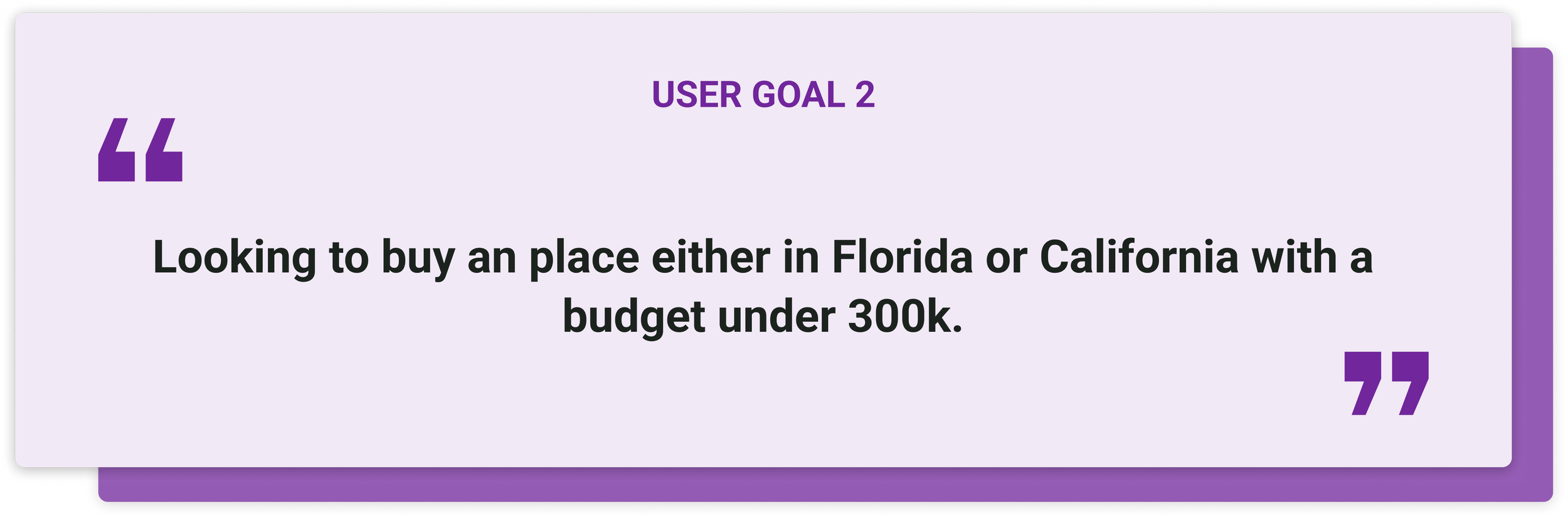
Step 1 User Persona
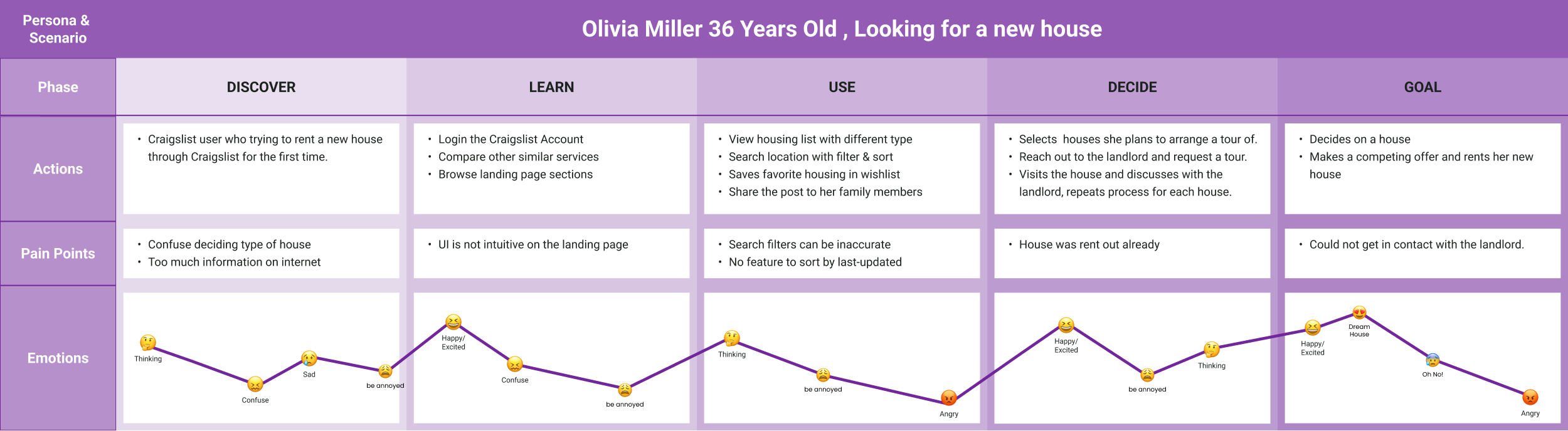
Step 2 Journey Map
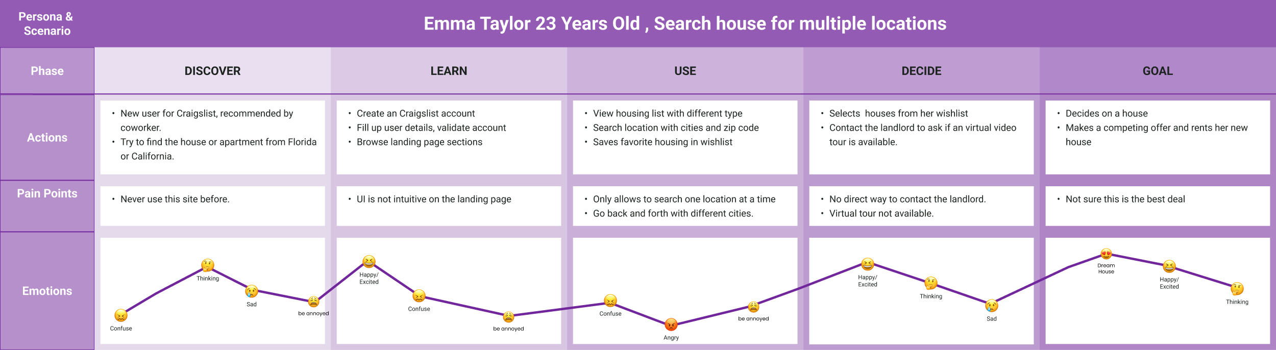
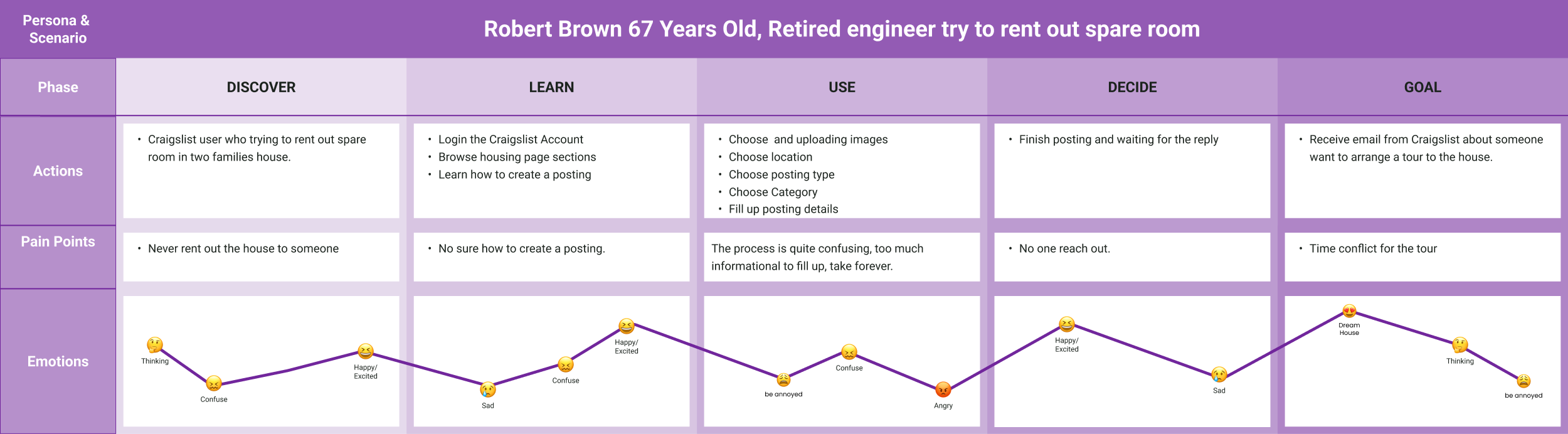
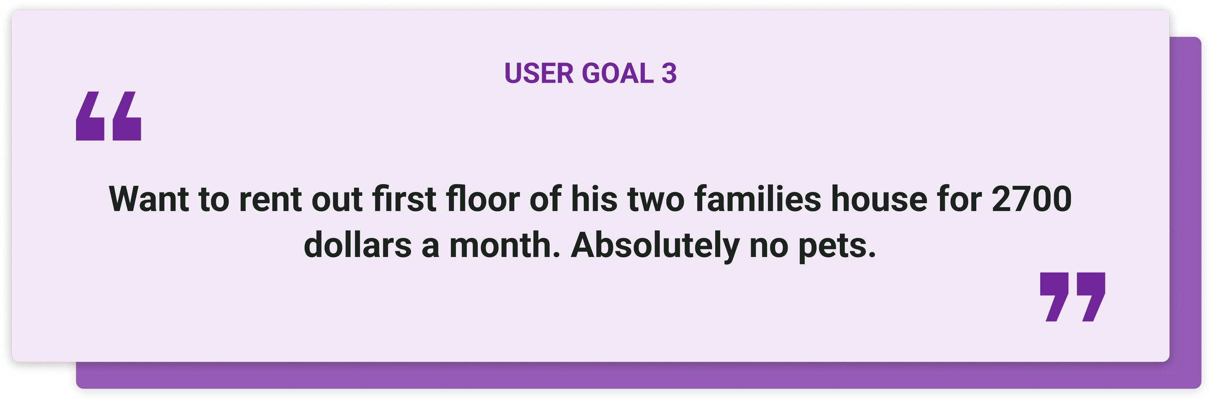
Step 3 User Goals
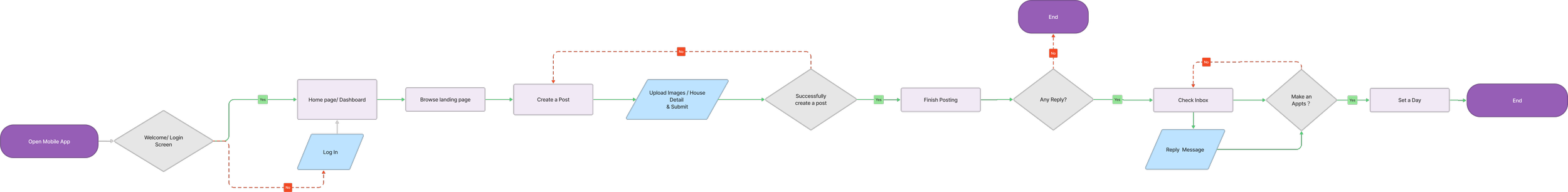
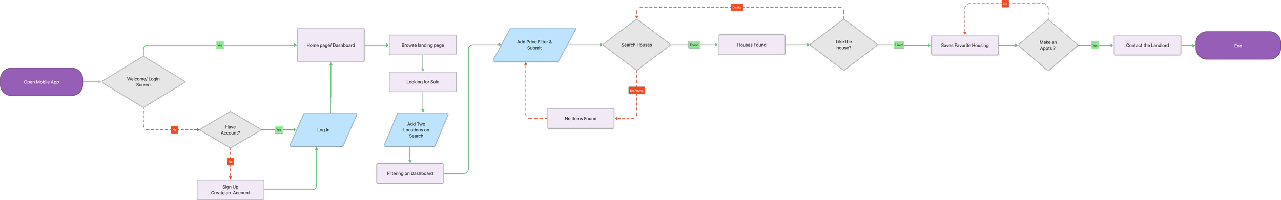
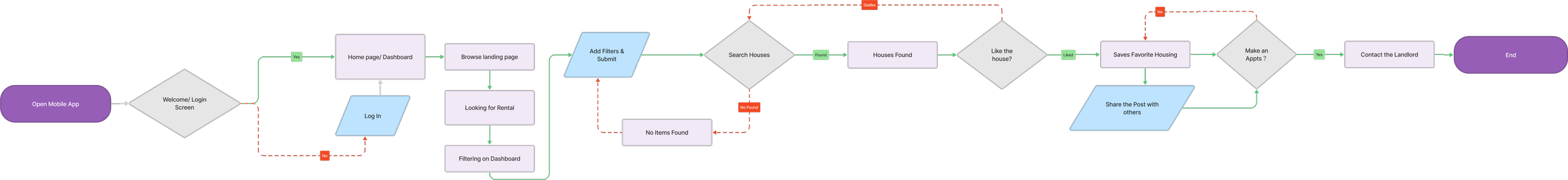
Step 4 User Flow
Information Architecture
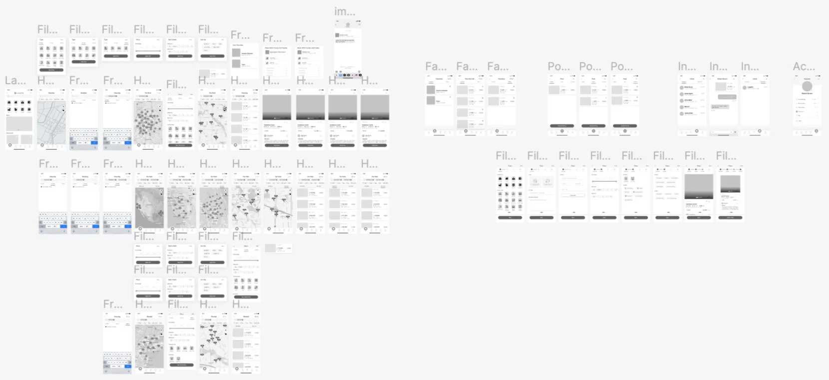
Low Fidelity Wireframe
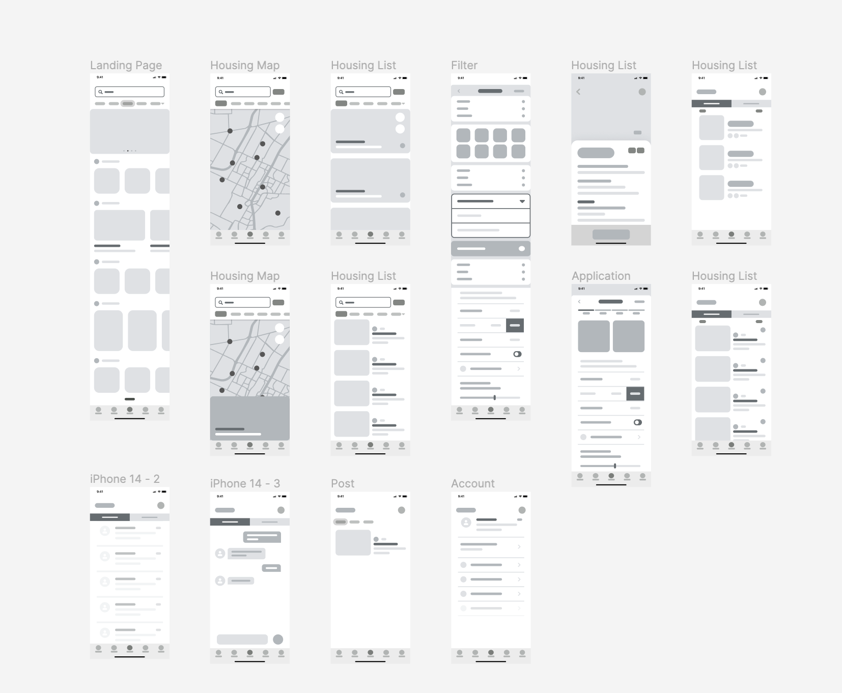
Mid Fidelity Wireframe
Usability Testing
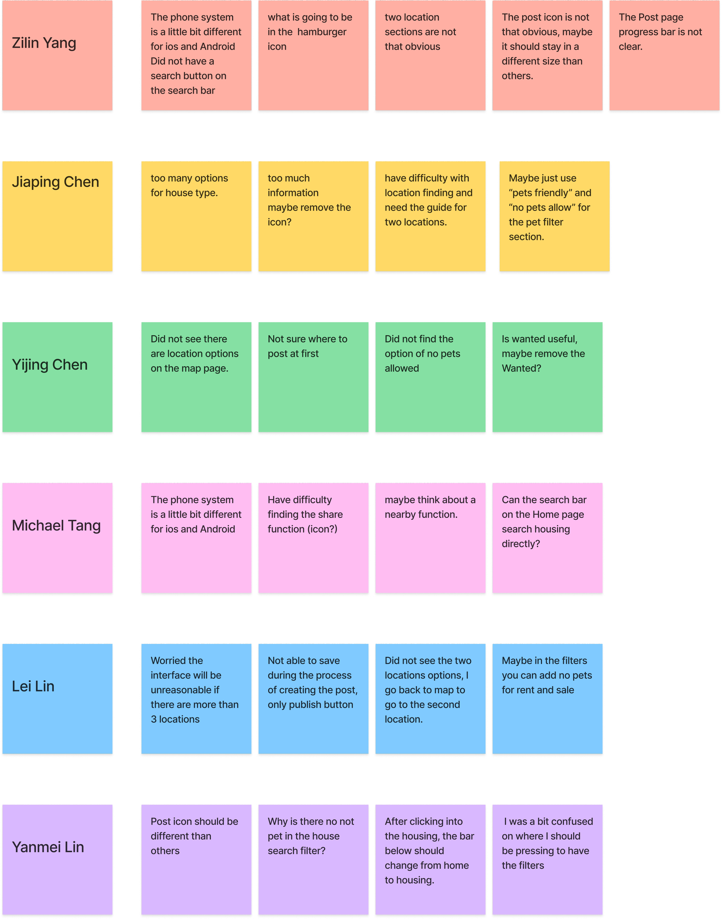
Step 1 Write Down Observations
Write down all the ideas, observations, or direct quotes from 6 participants onto individual sticky notes.
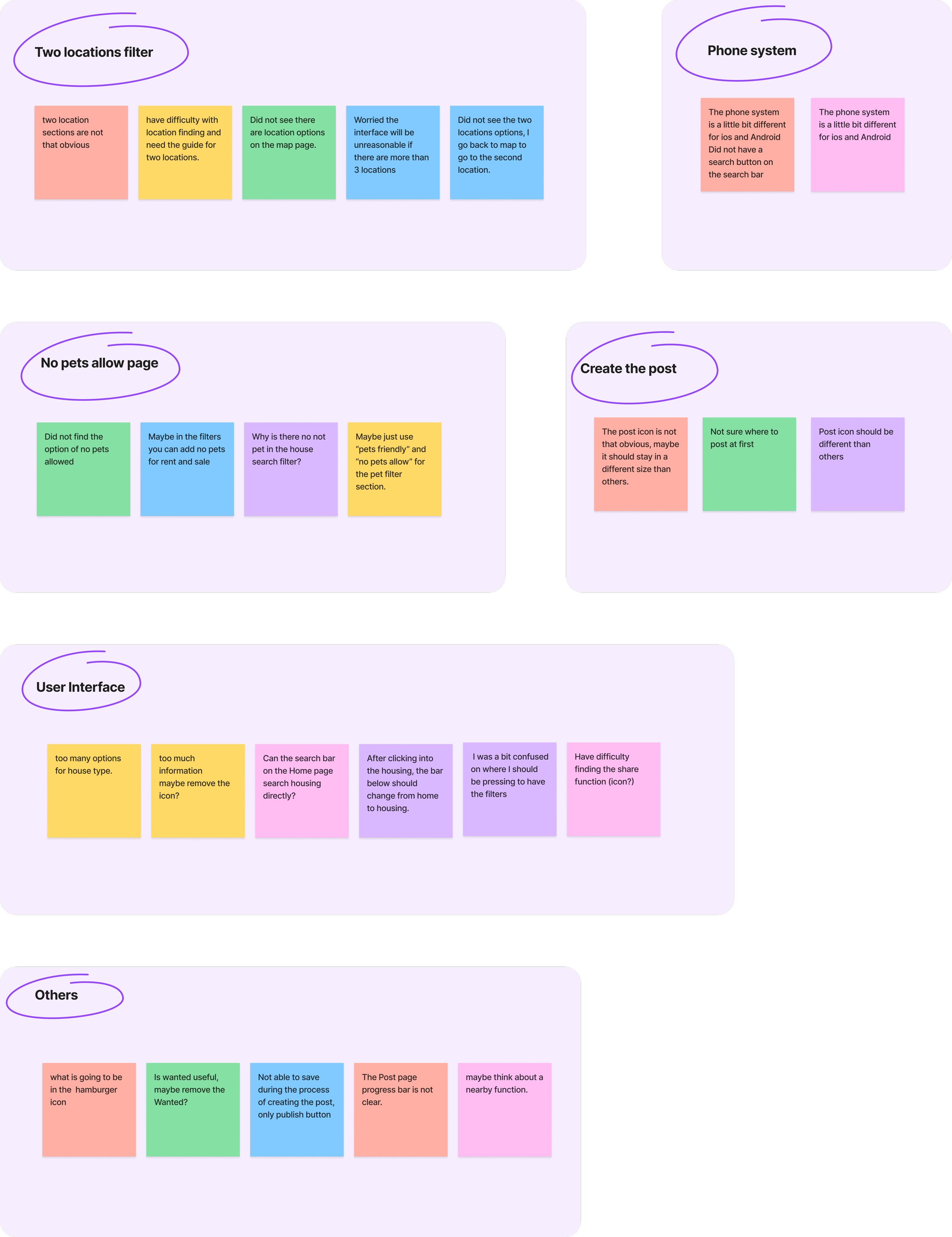
Step 2 Cluster the Info into Groups
Cluster all the ideas, observations, or direct quotes from 6 participants into groups.
Step 3 Come Up With Insights
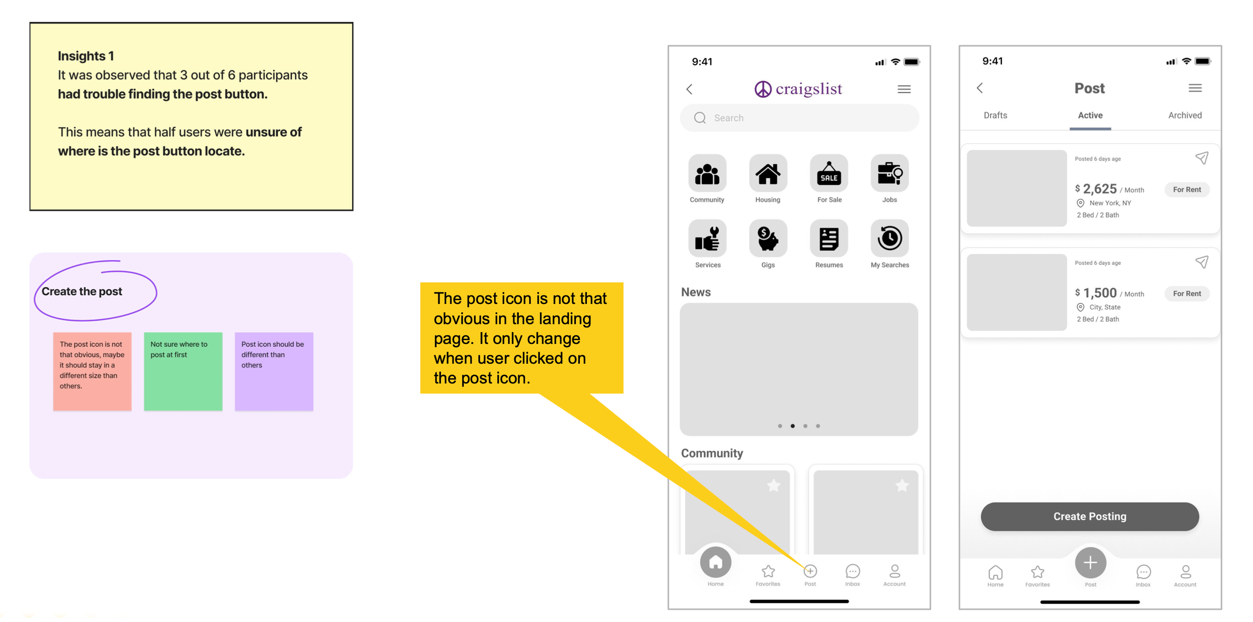
Insights 1
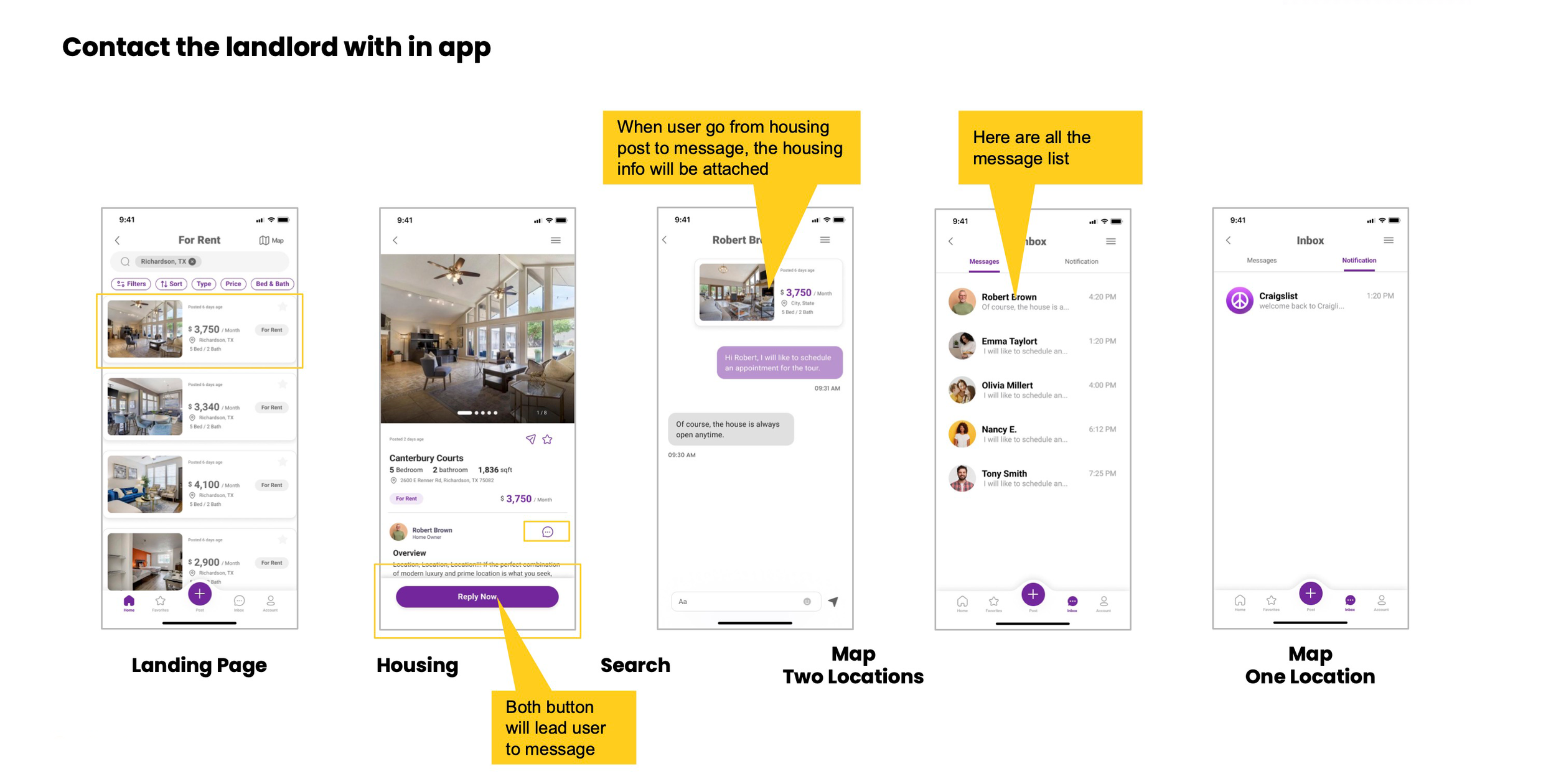
It was observed that 3 out of 6 participants had trouble finding the post button.
This means that half users were unsure of where is the post button locate.
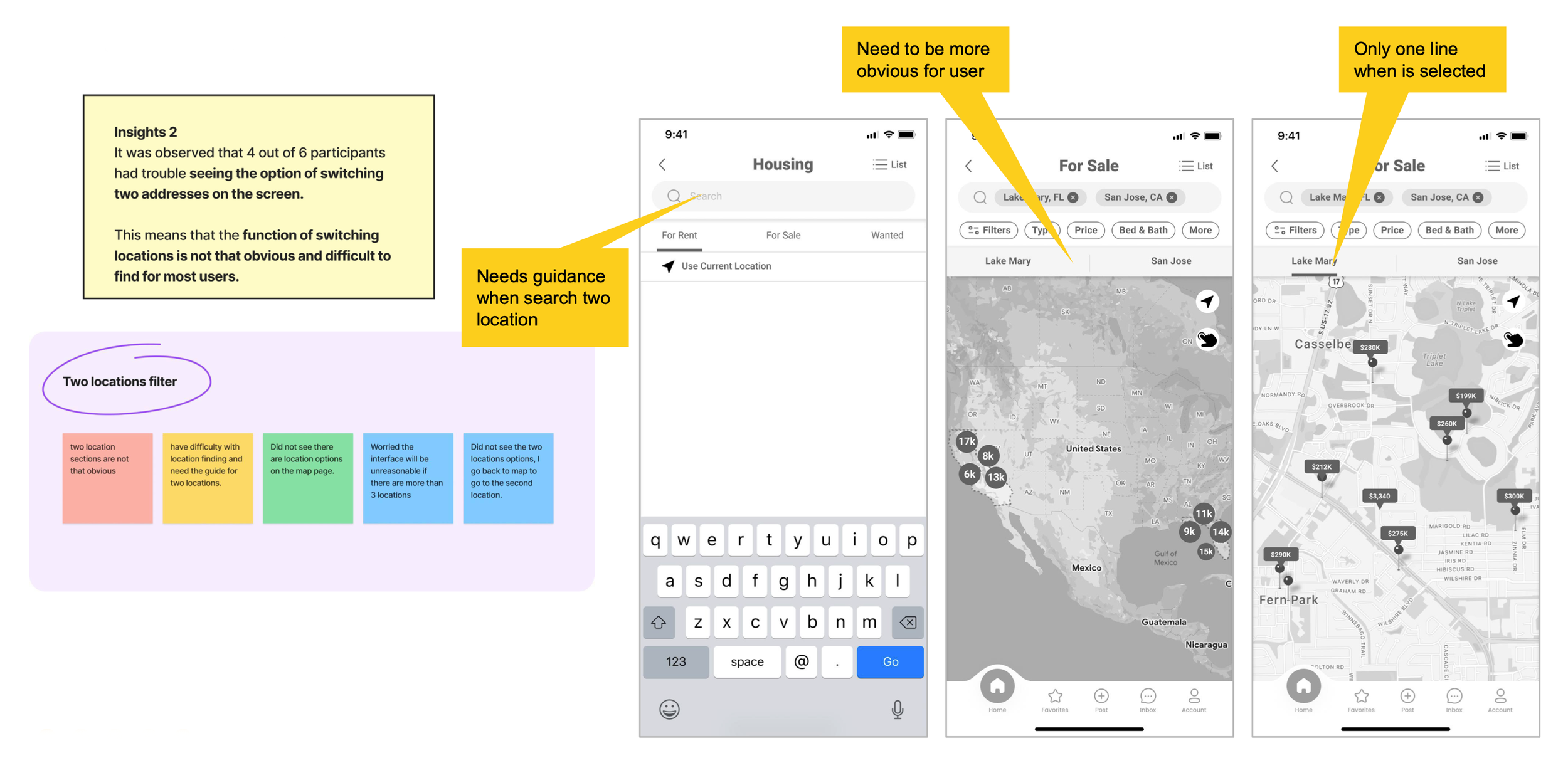
Insights 2
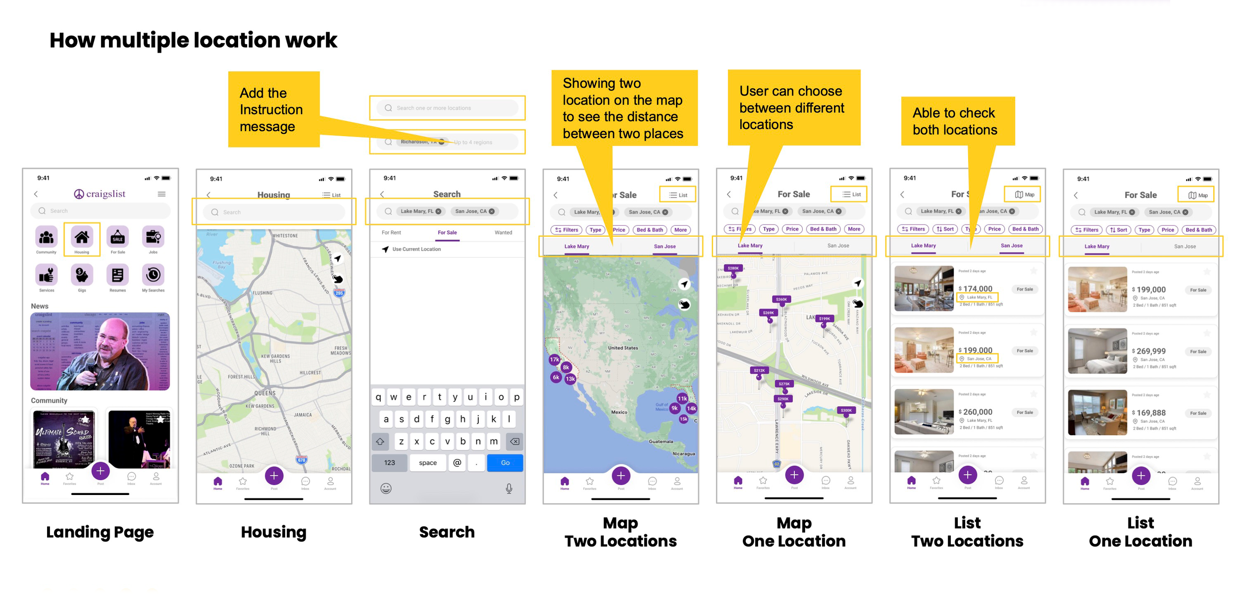
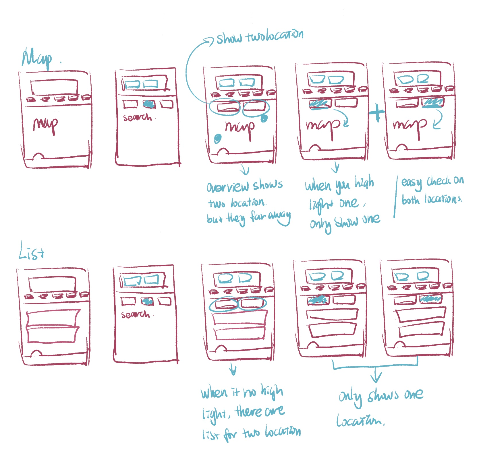
It was observed that 4 out of 6 participants had trouble seeing the option of switching two addresses on the screen.
This means that the function of switching locations is not that obvious and difficult to find for most users.
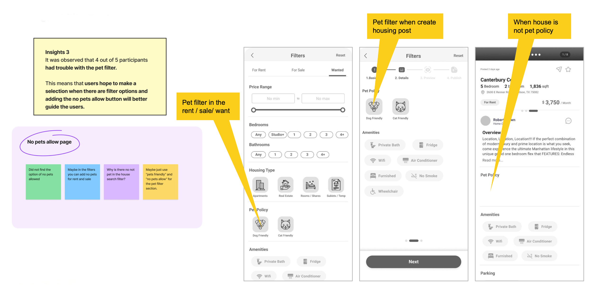
Insights 3
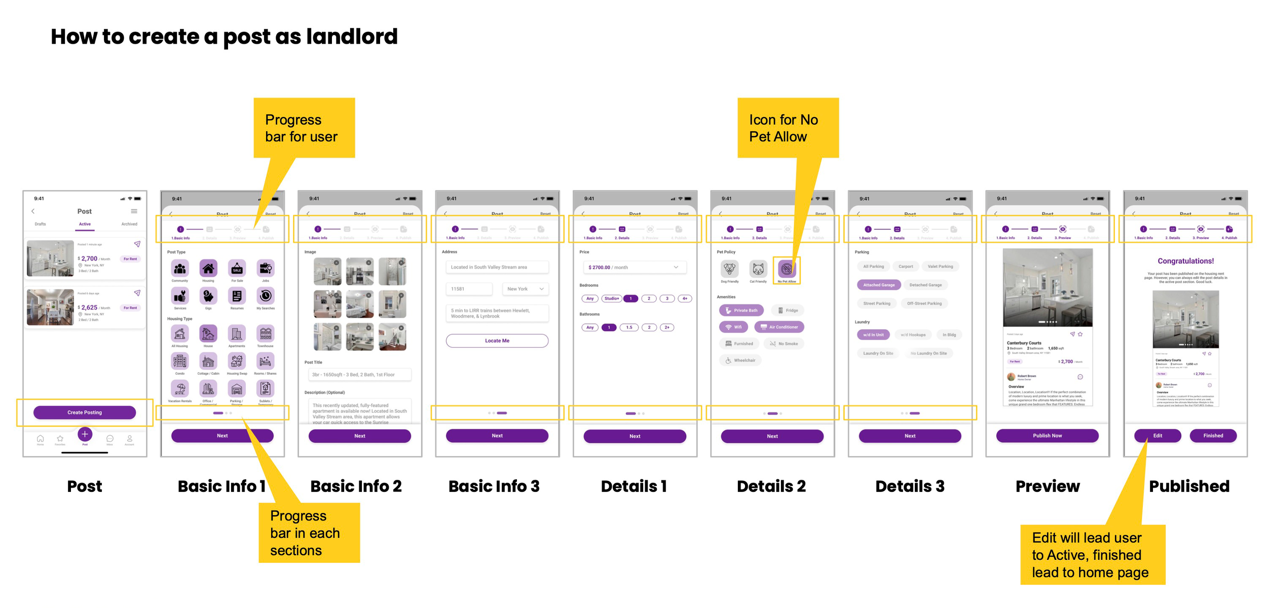
It was observed that 4 out of 5 participants had trouble with the pet filter.
This means that users hope to make a selection when there are filter options and adding the no pets allow button will better guide the users.