Dig Deeper丨In-Gallery Learning Experience
An interactive touchscreen and NFC-based game designed for the Corning Museum of Glass, created as an in-gallery experience alongside artifacts and exhibitions. The game invites children to explore how ancient glass was discovered, made, and studied through play, exploration, and physical–digital interaction.
My Role: UI/UX Designer & Researcher
Tool: Figma, Otter
Duration: 5 months丨Feb–Jun 2023
The Problem
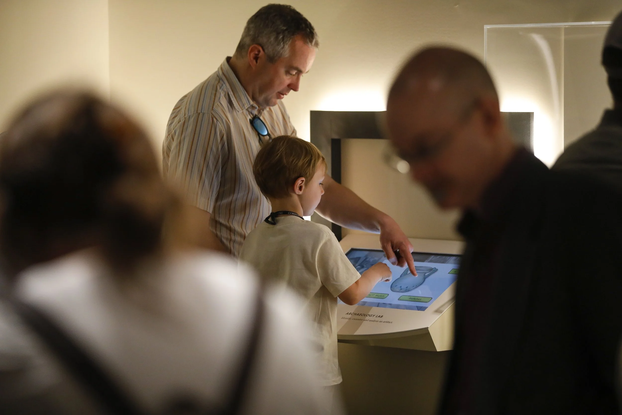
Designing an interactive educational experience for a museum gallery is fundamentally different from designing a linear digital product. Visitors (especially children and families) move non-linearly, arrive at different stations out of order, and often share a single device.
The challenge was to create a child-friendly experience that could:
Work across multiple physical stations
Tolerate interruptions and group use
Remain intuitive despite varying literacy levels
Solution & Goals
I designed an NFC-enabled, touch-based interactive game that guides visitors through artifact discovery and glassmaking processes across multiple physical stations.
The solution focused on:
Flexible, non-linear entry points
Clear visual cues and progress feedback
Tap-first interactions designed for young users
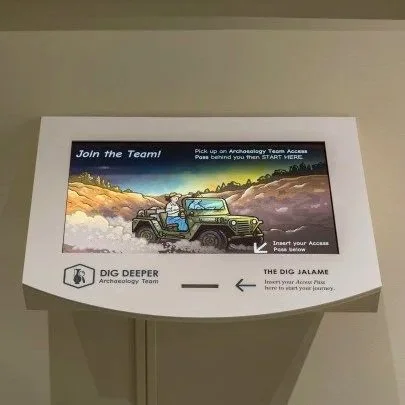
Dig Site — Entry station where visitors begin their journey by exploring a 3D model of the original Jalame excavation site.
Starting Point
Overview
The high-level concept and narrative were defined in collaboration with curators and the Interpretation team.
When I joined the project, my responsibility was to translate interpretive intent into a usable, testable, and engaging digital system, one that could function reliably within a physical gallery environment.
User Flow Definition
Defined end-to-end user flows across four physical stations (Dig Site, Archaeology Lab, Glass Workshop, Marketplace)
Balanced narrative structure with real-world visitor behavior, including interruptions and non-linear movement
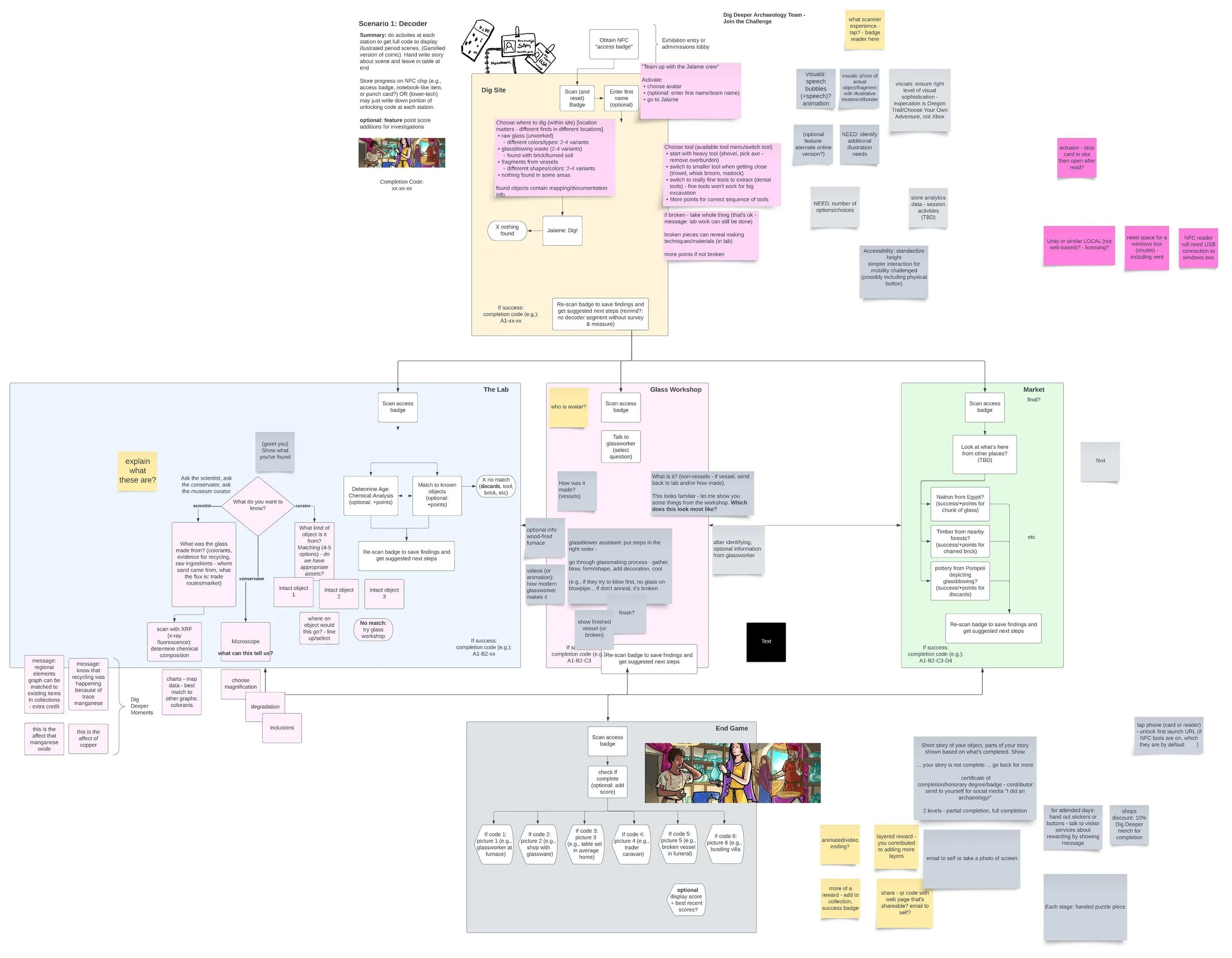
Early flow exploration mapping transitions across physical stations and digital states.
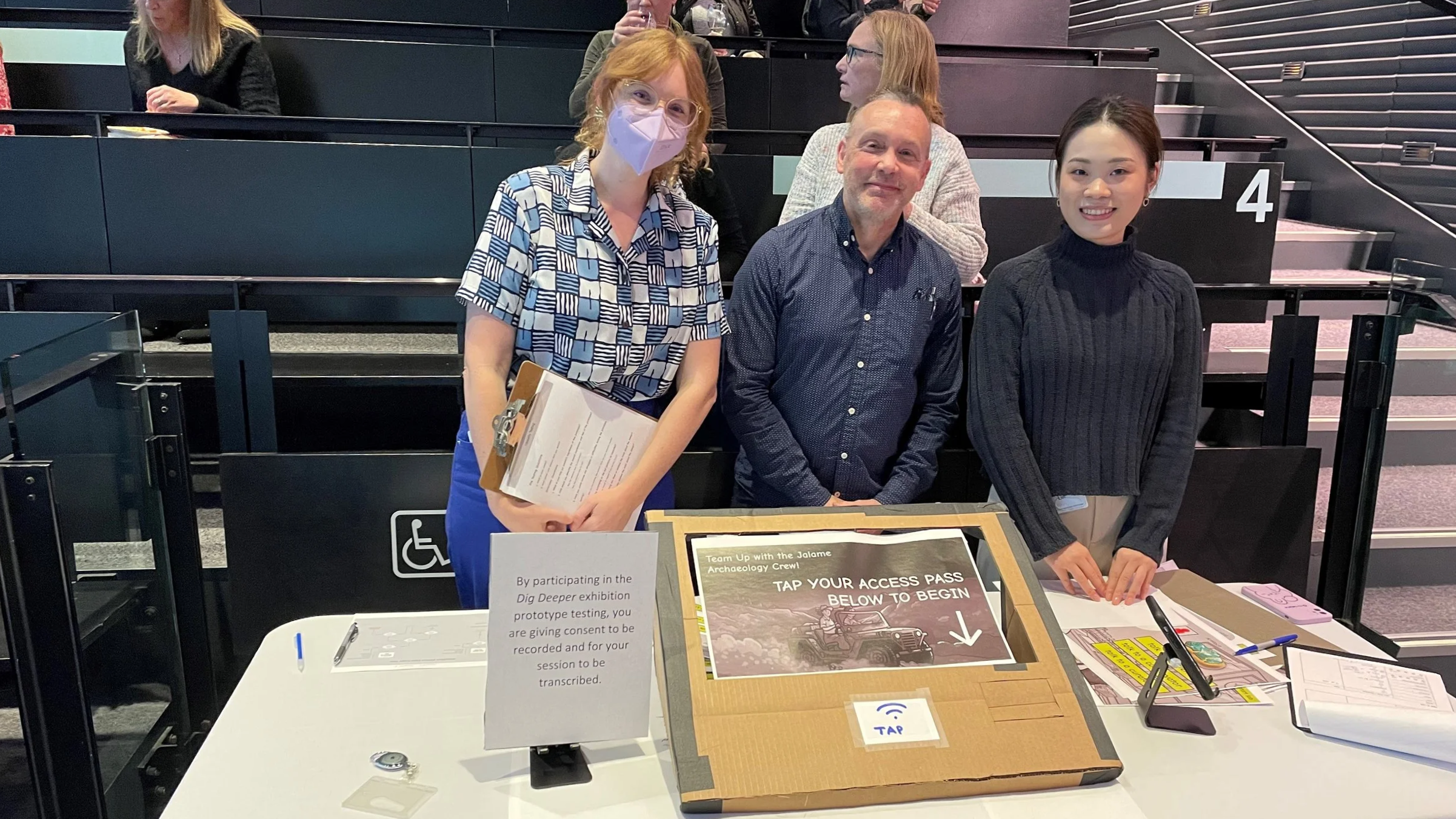
Paper Prototype & Key Insights
Methods:
Paper prototype testing in-gallery
Moderated task walkthroughs with think-aloud
Post-test interviews
Key Insights:
Transitions between stations (Dig Site & Lab) were often unclear
Reading level and vocabulary created barriers for younger users
Design Approach丨Dig Site Station
Reducing reliance on text through visuals and interaction cues
Making progress and next steps visible at all times
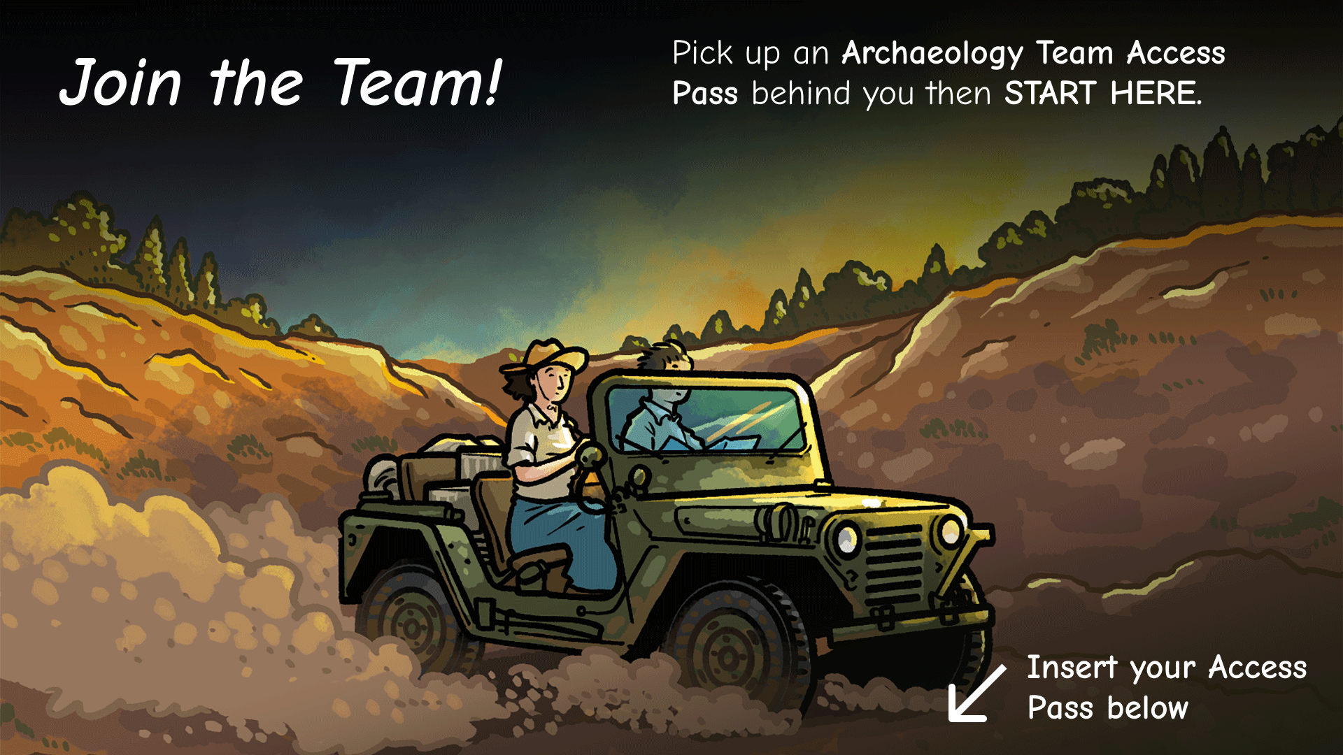
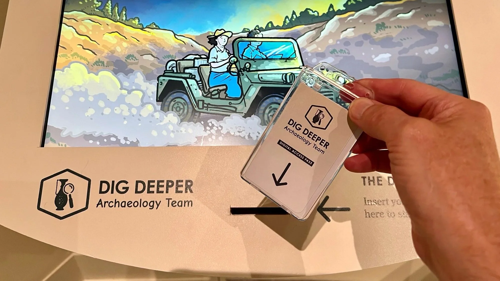
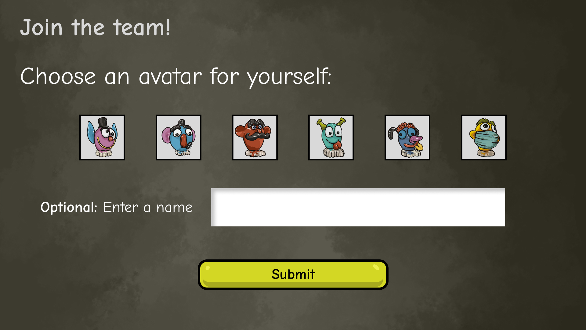
1. Join the Team
Narrative-led onboarding
Character-based entry sets context without relying on text.
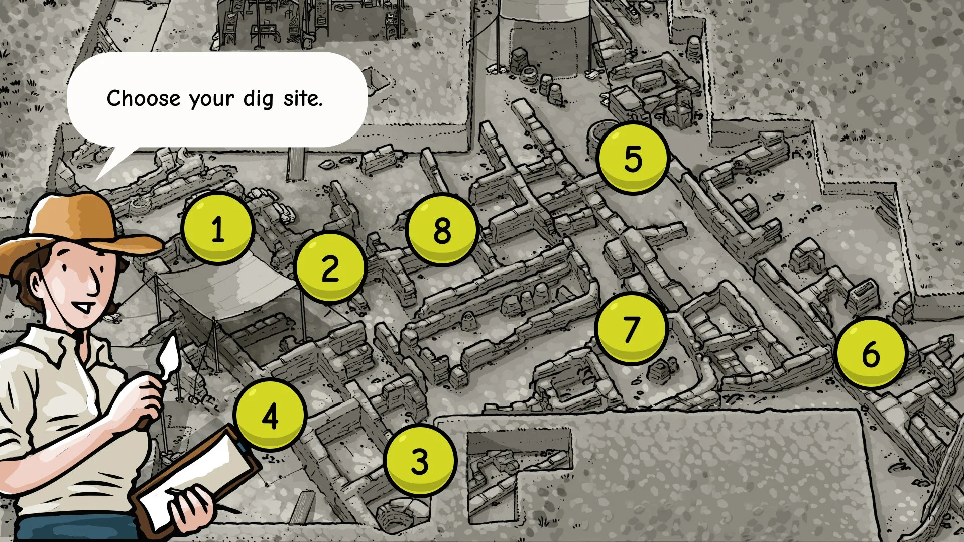
2. Choose a Dig Site
Map-based exploration
Users freely select dig sites; not all locations contain artifacts.
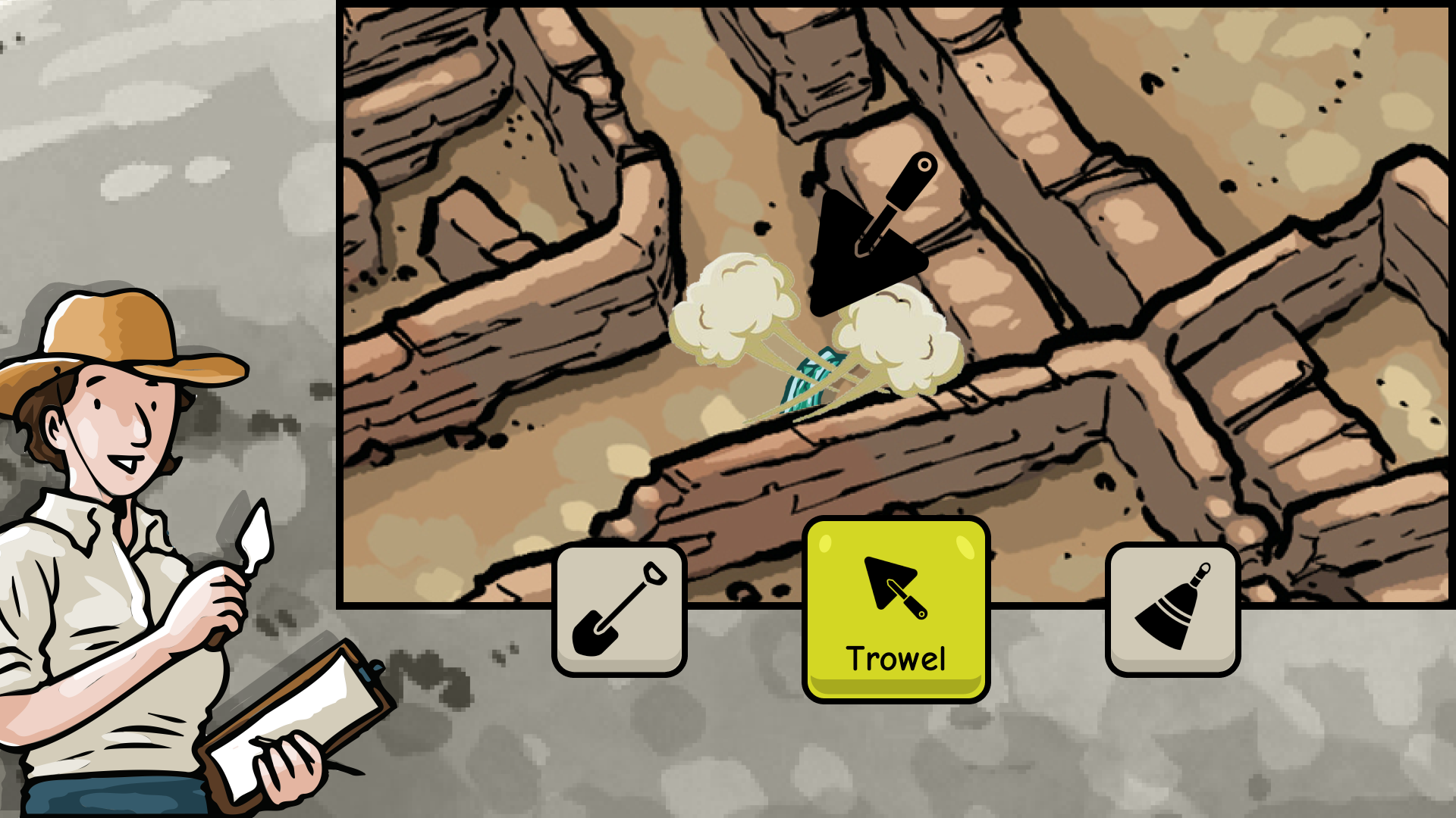
3. Select Tools
Visual-first interaction
Tools are introduced through icons and imagery instead of instructions.
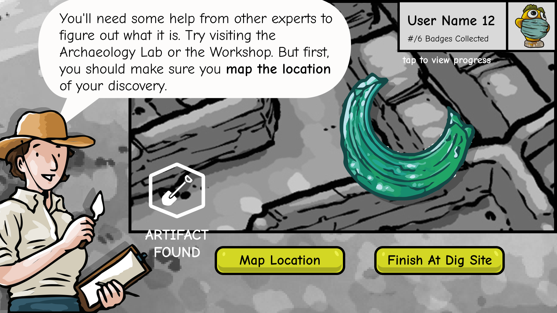
4. Discover Artifacts
Immediate feedback & reward
Visual confirmation reinforces discovery and progress.
Design Approach丨Other Station
Users can enter the experience from any station by selecting an existing artifact.
This reduces crowding, prevents drop-off, and supports real-world museum movement.
Users can continue from any station by selecting an existing artifact.
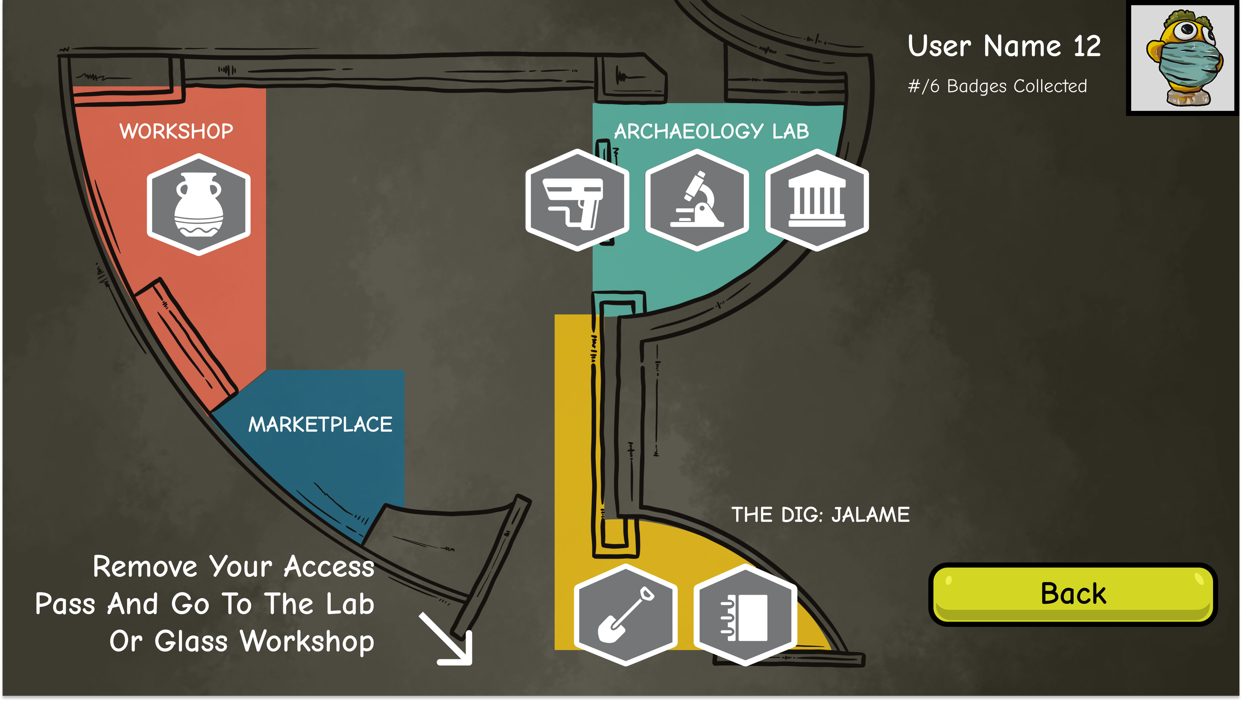
Map and profile views support re-entry and non-linear movement.
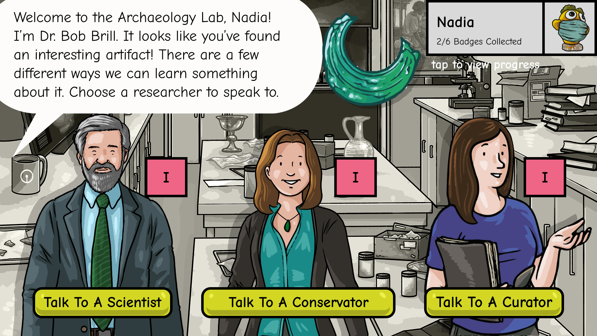
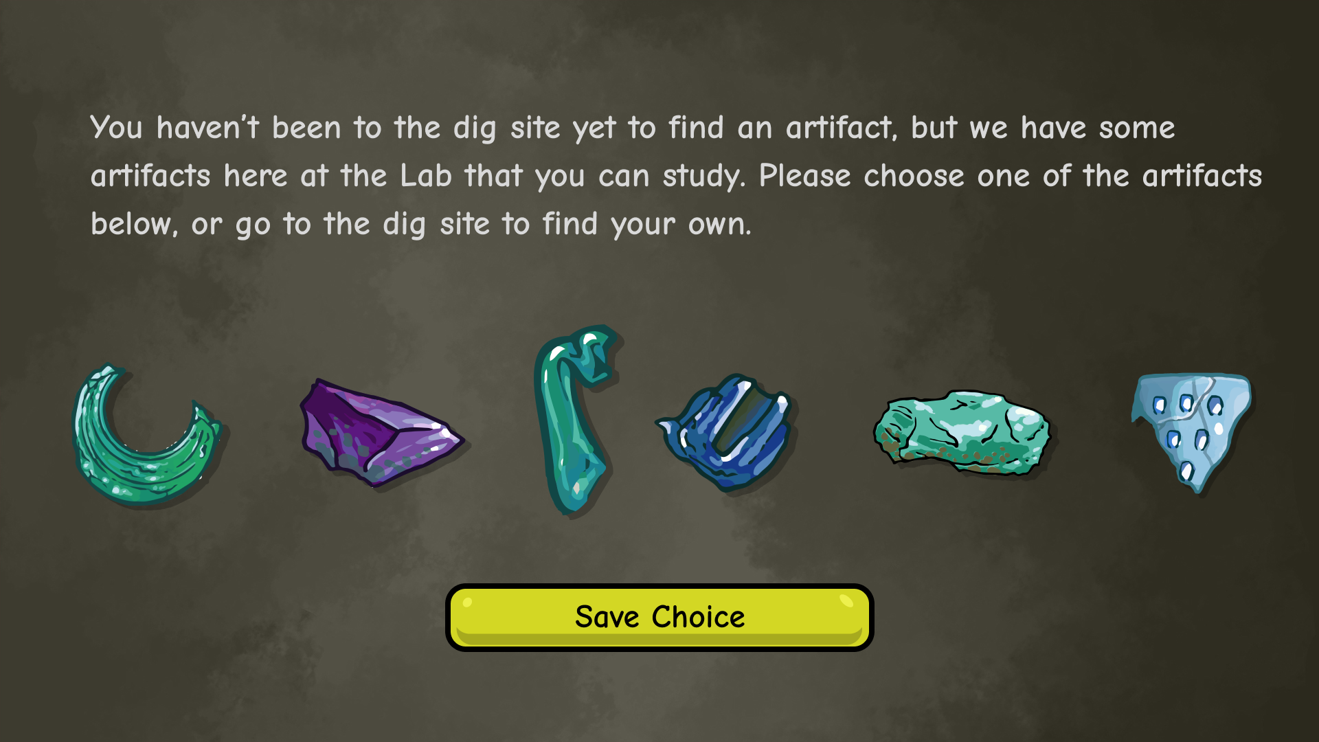
1. Archaeology Lab
From Discovery to Understanding Analyzes artifacts through visual matching and guided choices
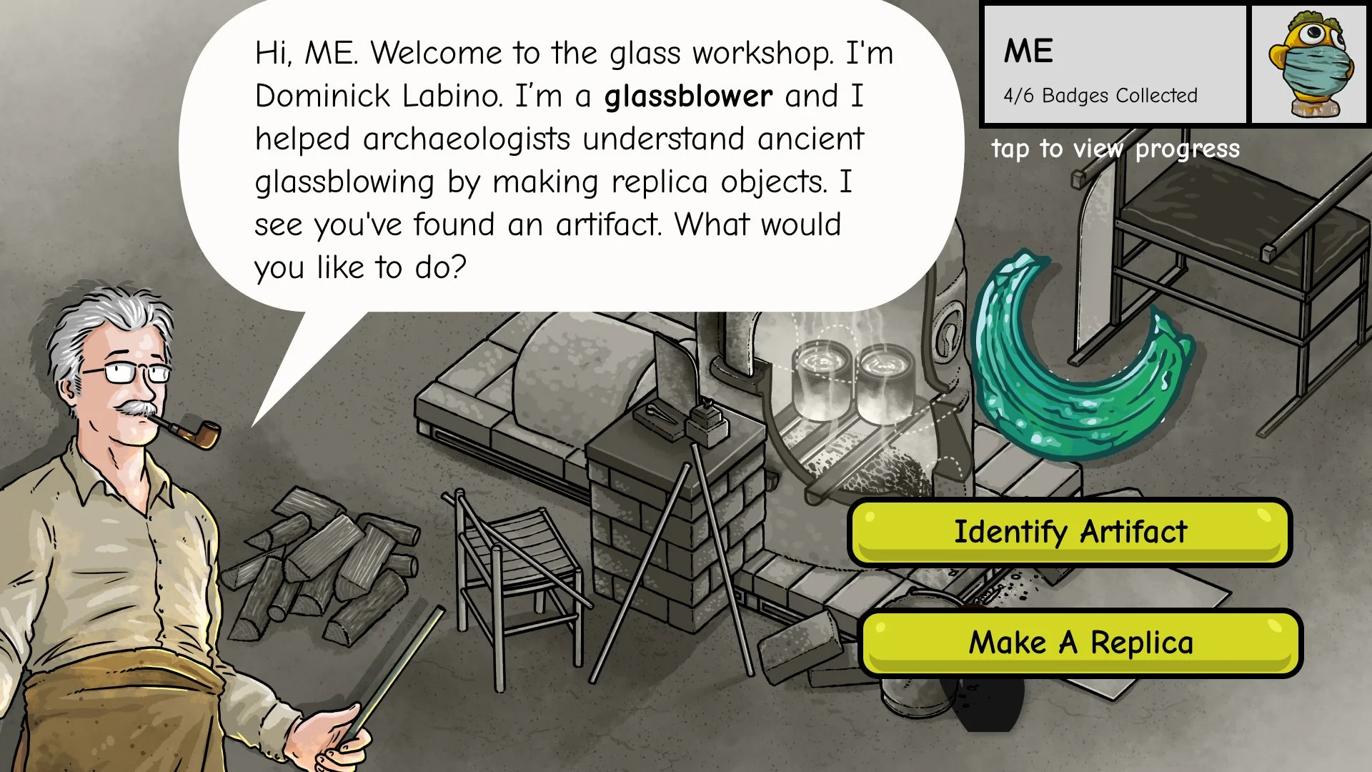
2. Glass Workshop
Making the Invisible Process Visible
Explores the glassmaking process step by step by creating a replica from found artifacts.
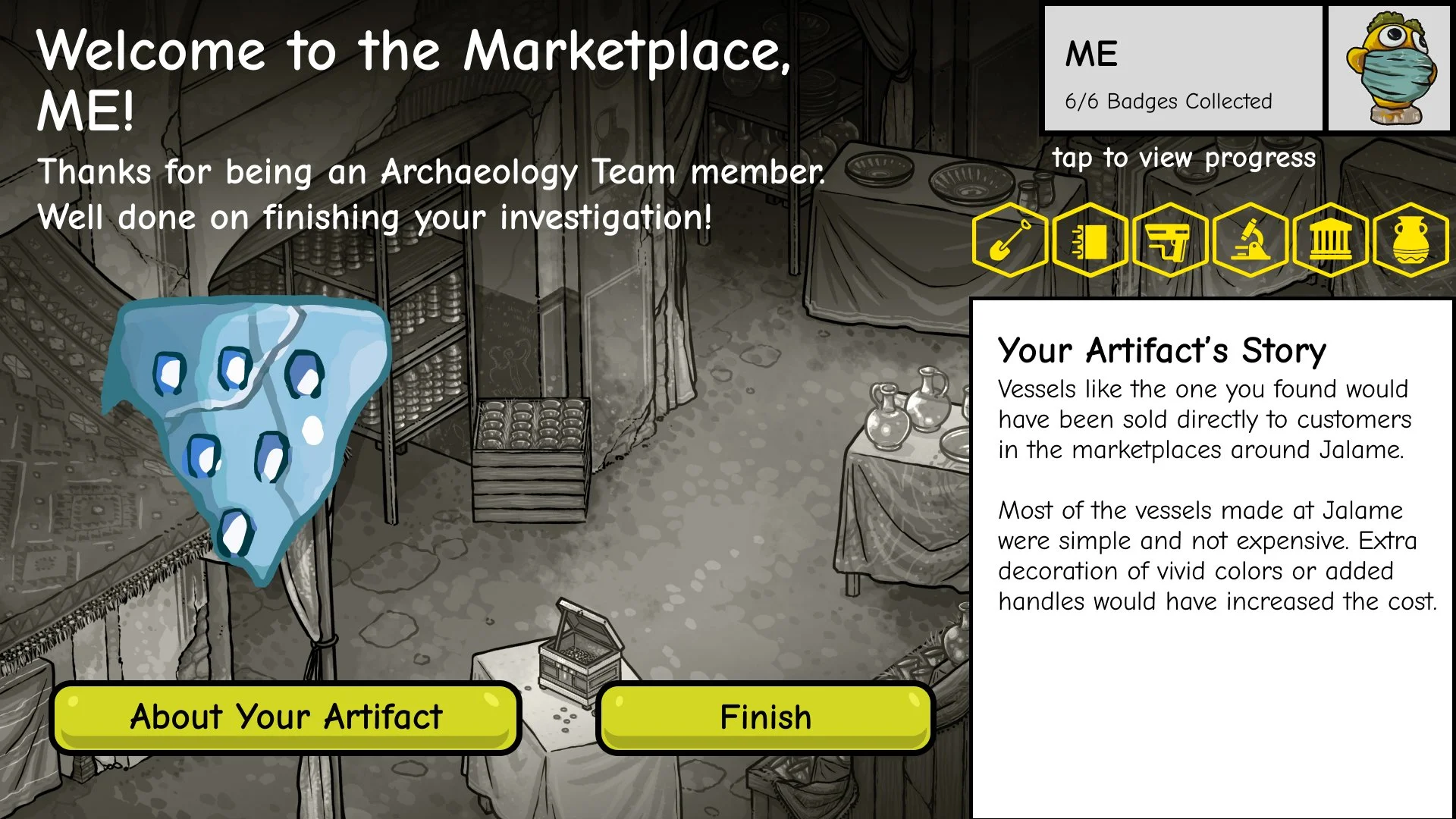
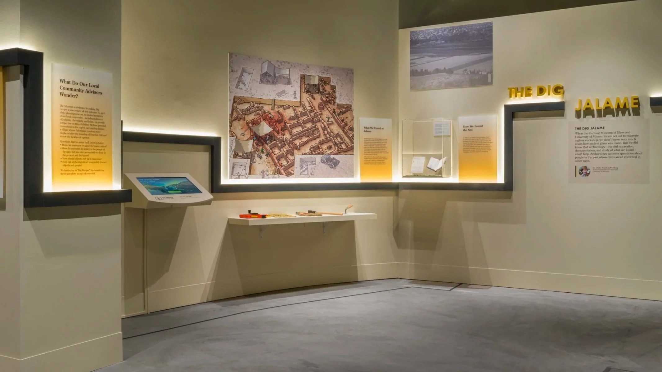
3. Marketplace
Reflection and Closure
Directs users back to real artifacts in the physical gallery.
Three Key Design Decisions
Designing for Non-linear Entry in Spaces
Problem
In a physical gallery, visitors arrive at stations out of order due to crowding, movement patterns, and group dynamics.
Decision
I designed the experience to support entry from any station, allowing users to select an existing artifact and continue without returning to the Dig Site.
Why It Matters
This reduced friction, prevented drop-off, and aligned the digital flow with real-world museum behavior instead of forcing a linear path.
Prioritizing Visual-First Interaction Over Text
Problem
Many target users were young children with limited reading ability and attention span.
Decision
I minimized instructional text and relied on visuals, icons, character guidance, and immediate feedback to communicate actions and progress.
Why It Matters
This made the experience accessible to a wider age range and allowed users to learn through interaction rather than reading.
Making Progress Visible Across Interruptions
Problem
Museum experiences are frequently interrupted by caregivers, siblings, or station availability.
Decision
I designed clear progress indicators, maps, and profile views so users could easily re-orient themselves after interruptions.
Why It Matters
This supported re-entry and continuity, ensuring the experience remained engaging even when played in short or fragmented sessions.
Outcome
Launched as a core interactive feature in the exhibition
Achieved a 34.9% completion rate
Engaged 2,700+ unique users in two months
Observed strong excitement and engagement, especially during artifact discovery and badge rewards