CMOG Digital Signage丨Dual Audience
A real-time digital signage system for high-traffic, time-sensitive glassmaking programs. Makes availability, capacity, and scheduling visible at a glance, reducing queue friction and supporting both visitors and staff.
My Role: UI/UX Designer & Researcher
Scope: Public-facing Availability Boards, internal operational boards
Duration: 6 months丨May 2023- Dec. 2023
The Problem
The museum’s glassmaking programs operate in a high-traffic, time-sensitive environment, where visitors are required to make decisions quickly.
Key Challenges:
Information asymmetry between staff and visitors
Late-stage decision making at the counter
High cognitive load in queue environments
Solution & Goals
The digital signage system reframed how availability information is communicated, shifting the decision-making before visitors reach the counter.
The solution focused on:
Early, shared visibility of constraints
Glanceable, visual-first communication
Supporting flow instead of explanation
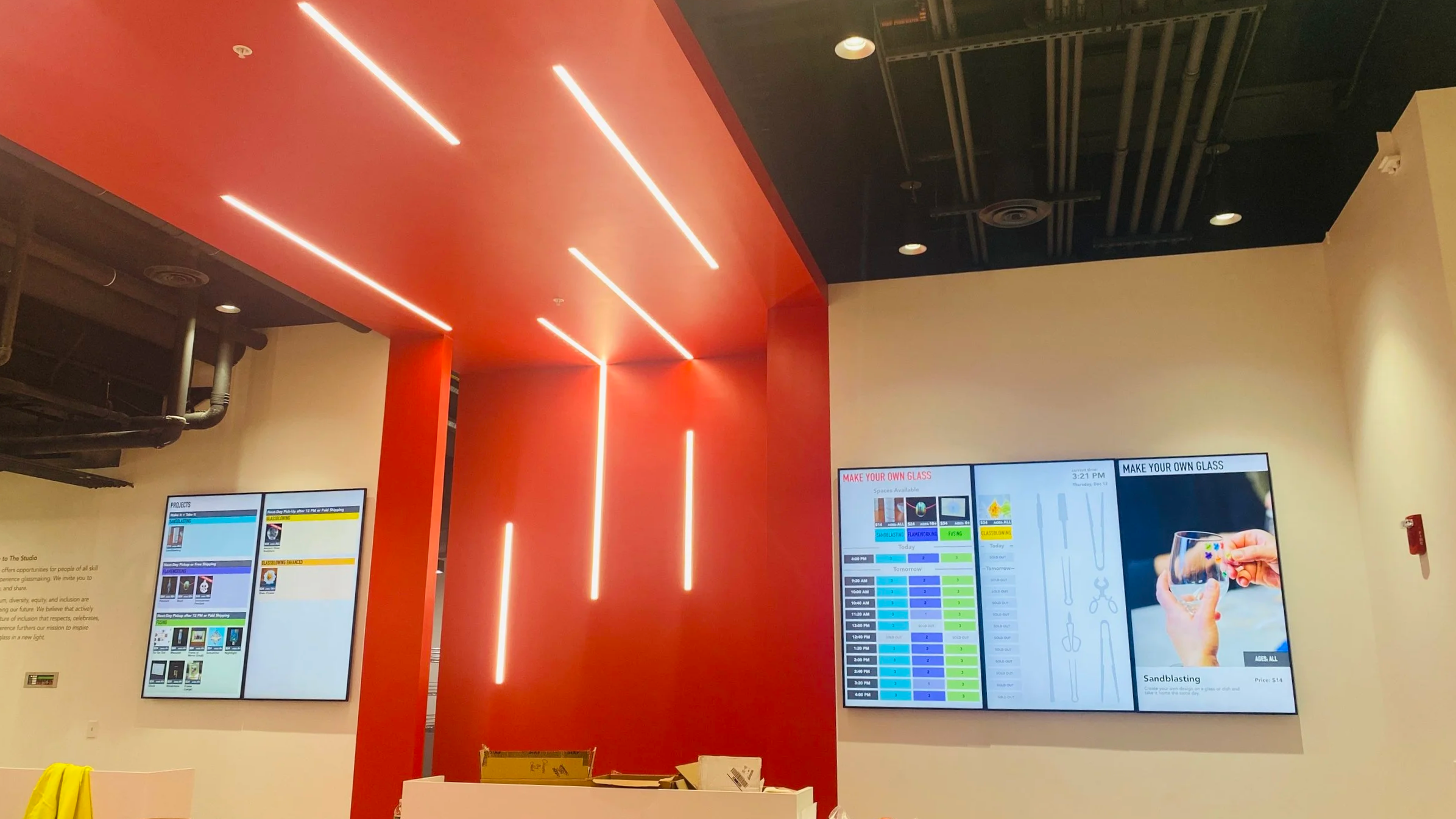
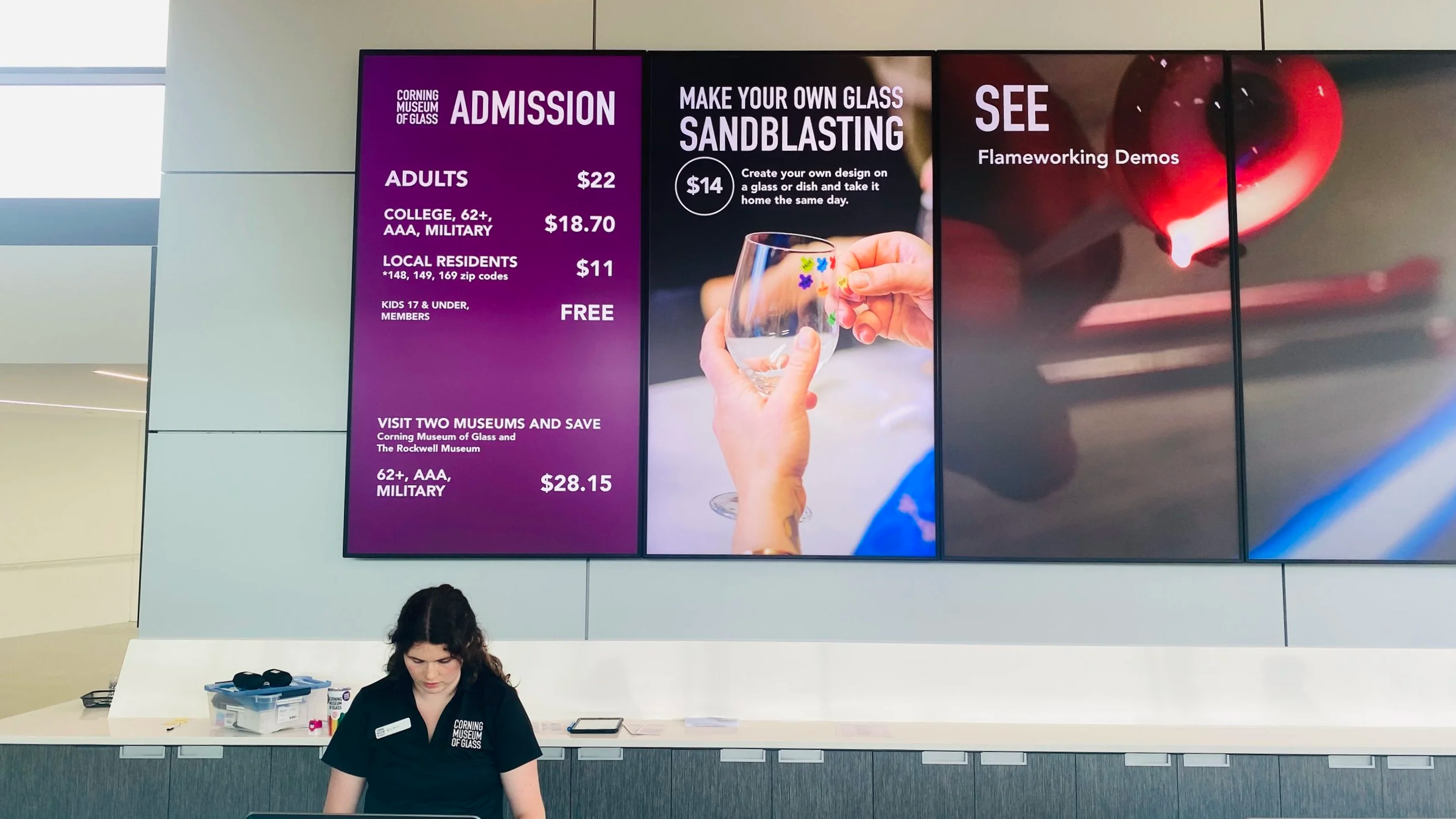
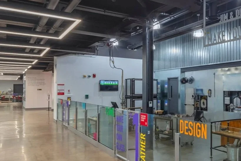
Availability Board Inside the newly expanded studio lobby
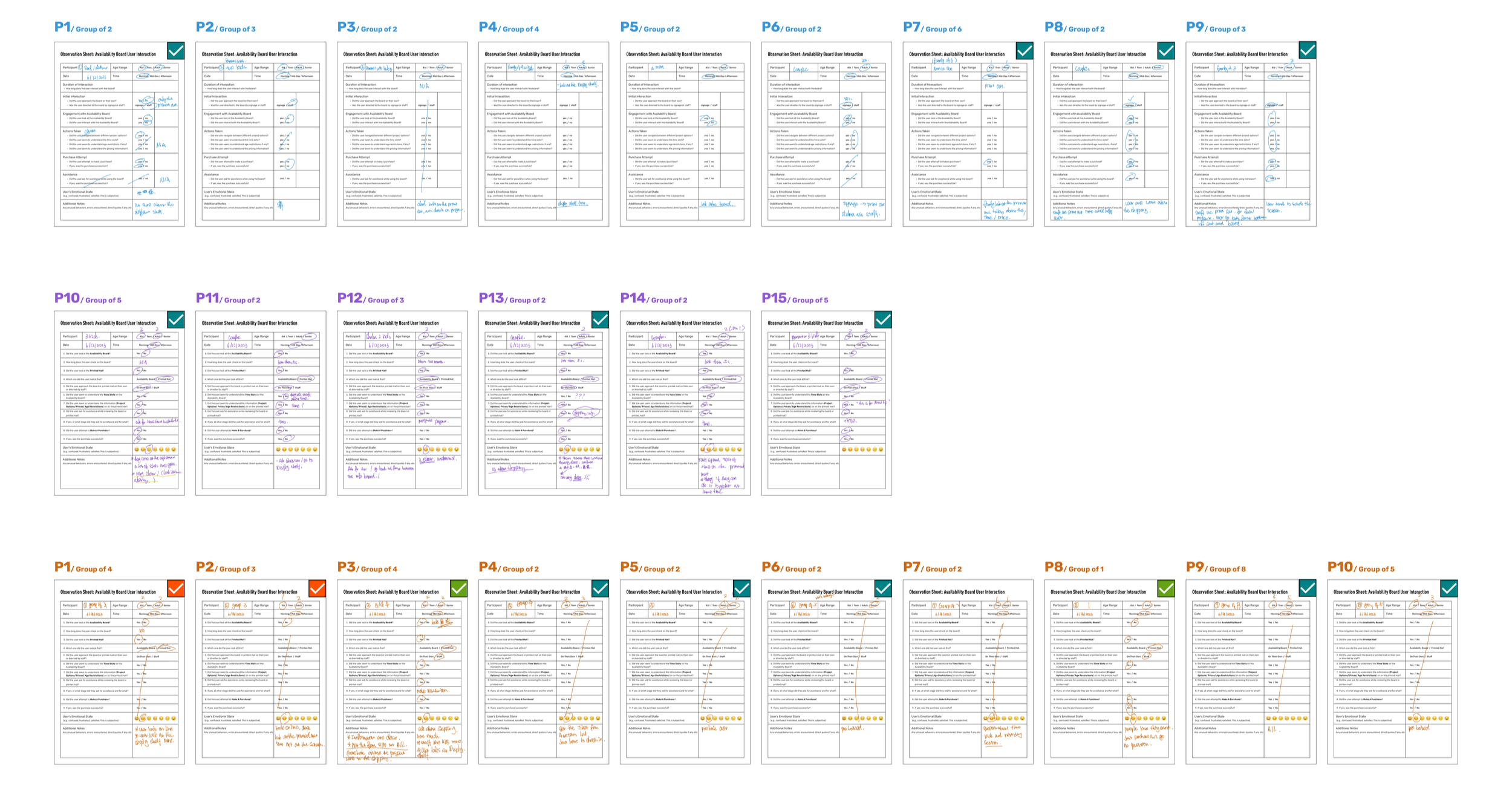
Research & Insights
Methods:
On-site observation in high-traffic studio and admissions areas
Contextual inquiry with guest services and studio staff
Scenario-based testing focused on queue behavior and decision timing
Key Insights:
Decision-making breaks down when availability is not visible before reaching the counter
Cognitive load peaks while visitors are waiting in line
Most staff questions are predictable and repeatable
Shared visual context reduces explanation and friction more effectively than verbal guidance
On-site notes and scenario-based observations.
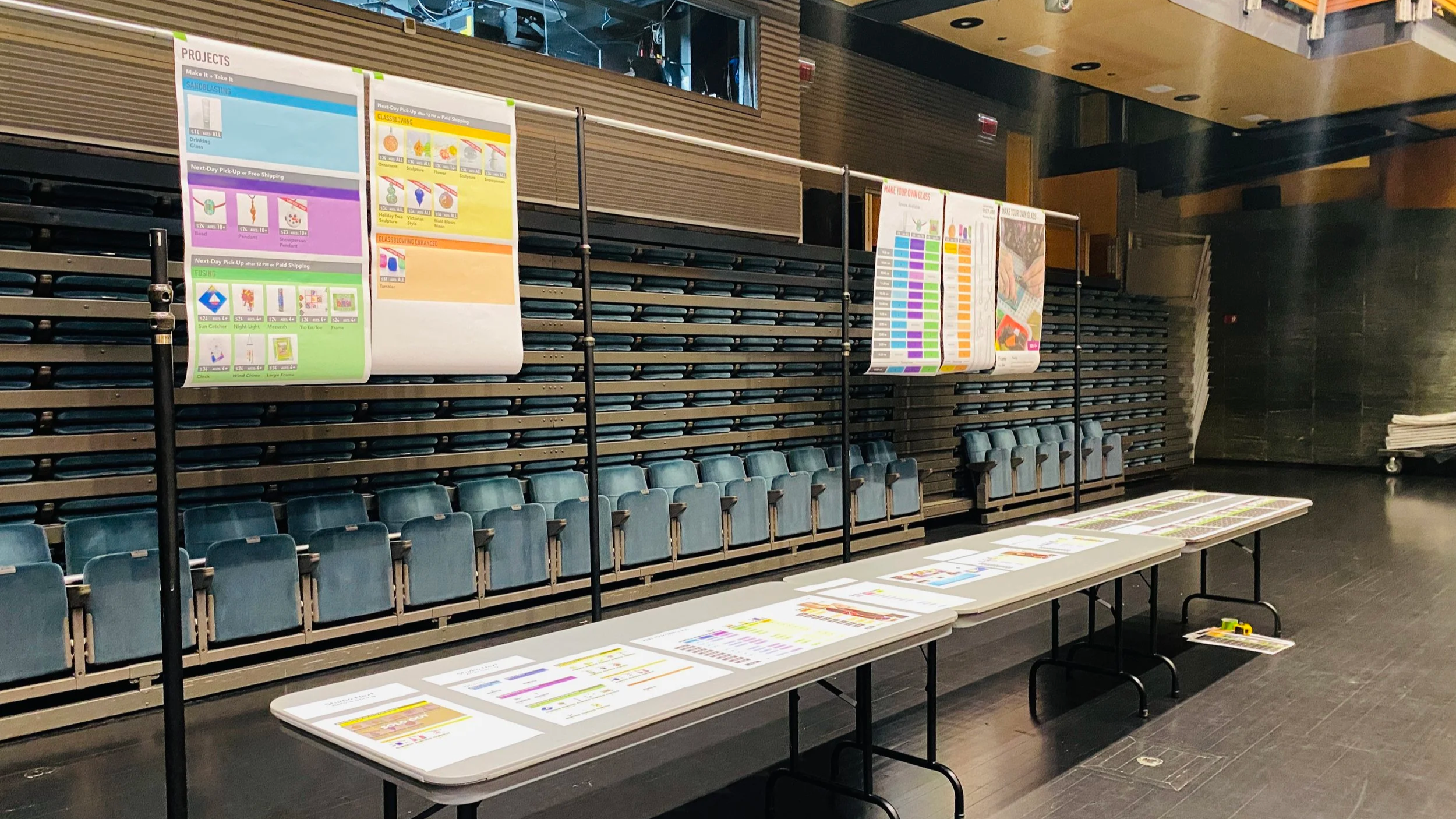
Early draft review with stakeholders in a real-world setting.
Design Approach
The signage was designed as an operational UX system, not a collection of displays.
Prioritize glanceability over completeness
Make constraints visible without requiring explanation
Support both visitor understanding and staff operations simultaneously
Decision 1 — Structuring Information for High-Traffic Use
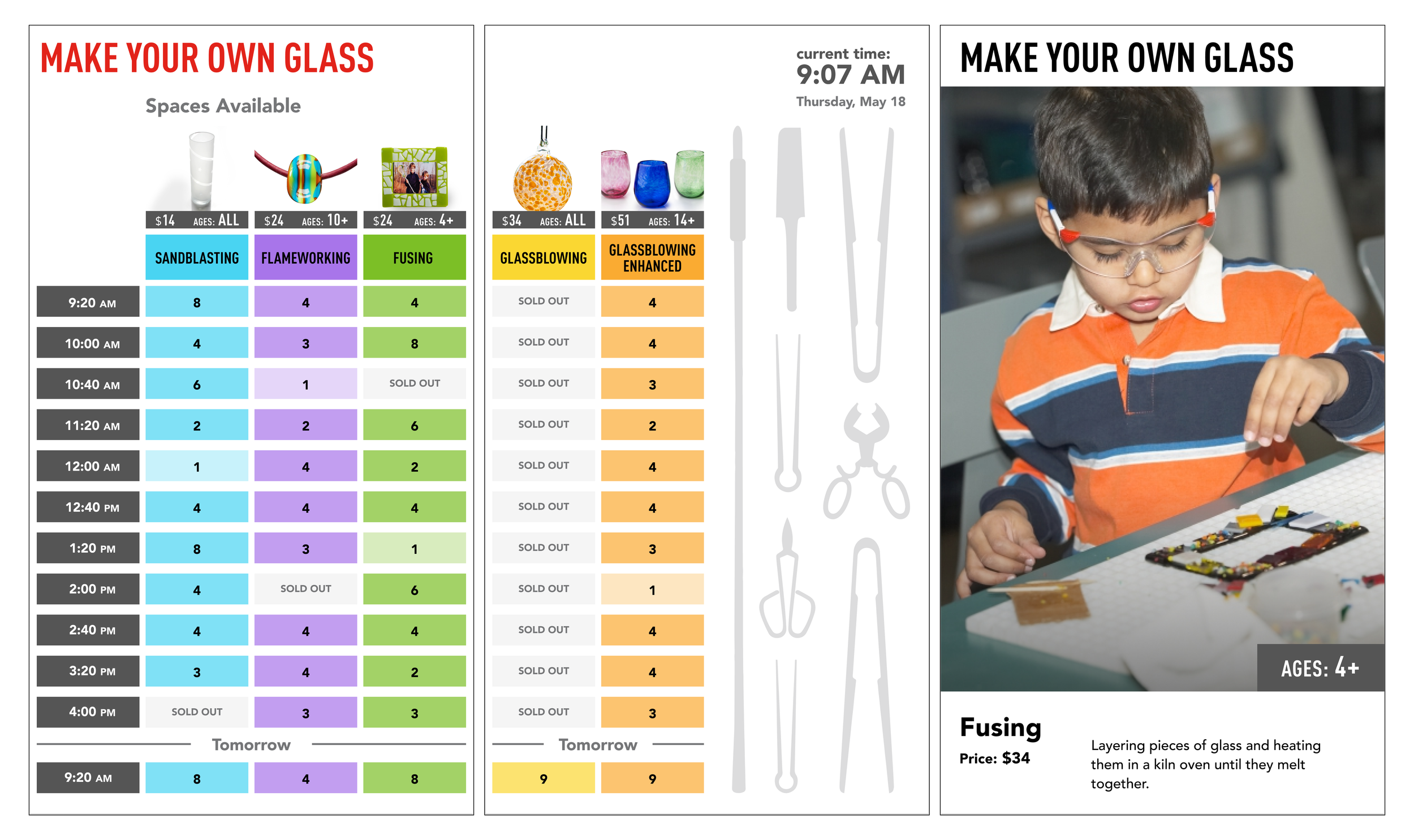
To support fast decision-making in line, the signage system was structured into three coordinated screen types, each serving a distinct cognitive role while sharing a unified visual language.
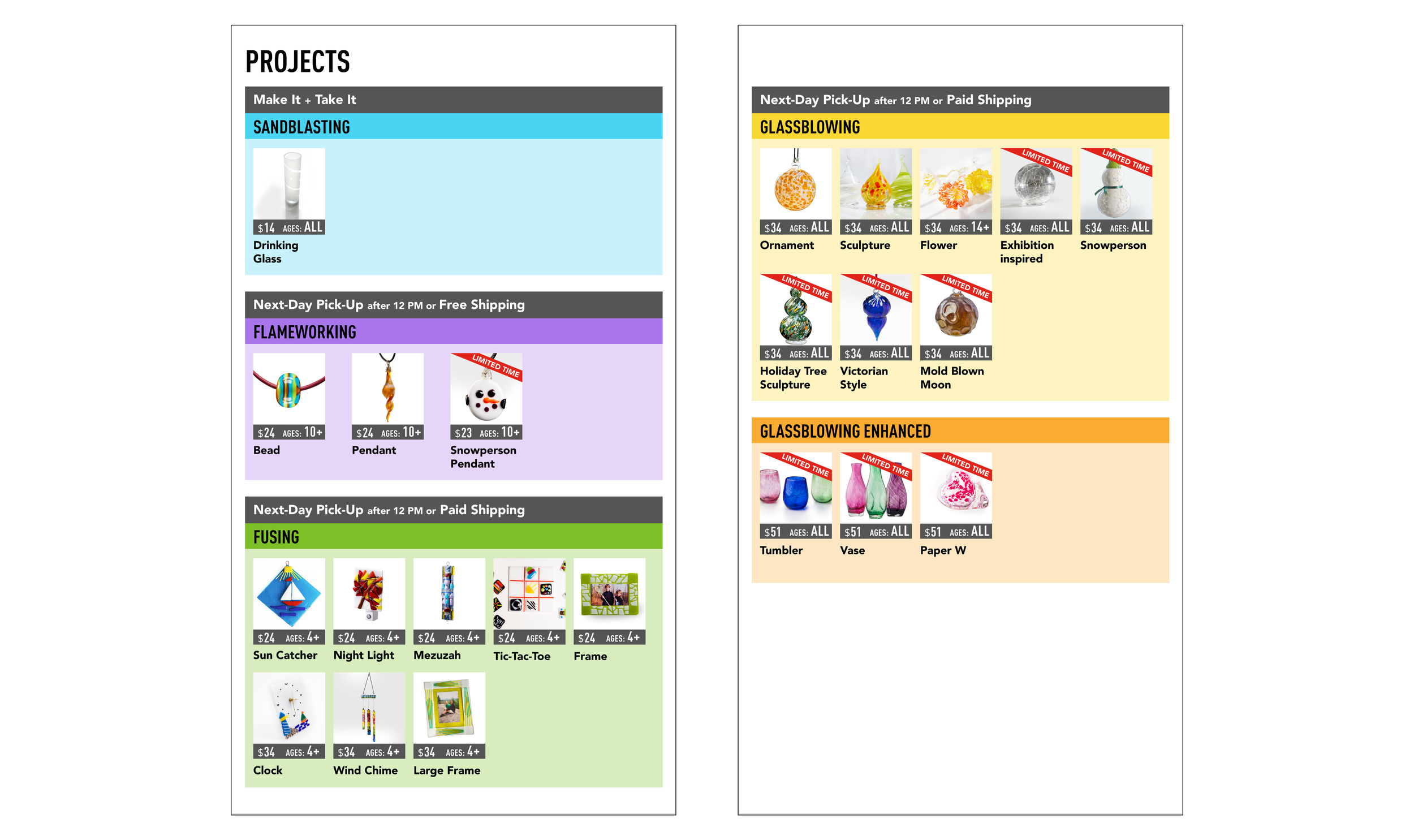
1. Activities Options Screens
Activities are color-coded and grouped by glassmaking technique, helping visitors differentiate options quickly.
Key information is visually highlighted:
Project Price
Age requirements
Seasonal availability
Same-day pickup vs. next-day pickup
2. Availability Board Screens
Time and availability are presented visually for quick comparison
Color coding aligns with the Activities Options Screens to create a clear mental link
Reduced opacity is used to indicate time slots that are nearly sold out
3. Promotion Screen
Introduces glassmaking techniques through large visuals and minimal text
Designed to transition from static imagery to video content over time
Decision 2 — Designing Context-Specific Availability Boards for Different Spaces
Separate availability board designs were created for the admissions lobby and the studio lobby, reflecting differences in viewing distance, dwell time, and visitor intent.
While the admissions lobby includes broader exhibition and orientation information, the studio area requires focused, action-oriented availability and visibility.
Admissions Lobby
Supports orientation and discovery
Balances exhibition information with high-level availability cues

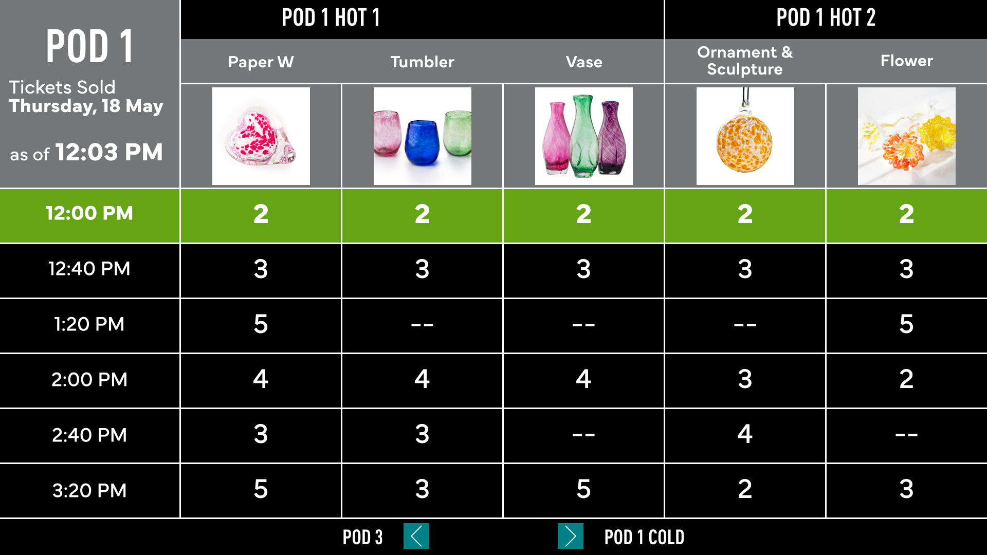
Decision 3 — Dual-Audience System Design: Availability Board & Big Board
The system supports both public-facing Availability Boards and an internal operational “Big Board”, each designed for a distinct audience and use case.
While the Availability Board prioritizes decision-making for visitors, the Big Board provides staff with real-time operational visibility. Both were built on a shared underlying logic to reduce miscommunication and friction.
Big Board (Internal Operations)
Displays location (pod), time slots, and capacity at a glance
Each pod has a dedicated screen for focused, local operations
Navigation controls allow staff to quickly switch views across pods
Outcome
Reduced repetitive staff questions and improved queue flow during peak hours
Enabled visitors to make decisions before reaching the counter, shortening transaction time
Enhanced overall visitor experience, contributing to a 7% increase in attendance and 8% revenue growth driven by higher engagement in 2024
Reflection & What I learned
Designing for physical environments requires treating information as a shared system, not isolated screens
The most impactful UX work often happens before interaction begins, shaping decisions upstream