CMOG Online Reservations丨Ticket System
Redesigned the current museum ticketing system into a mobile-first, scalable experience, supporting both general admission and highly constrained hands-on glassmaking reservations across multiple locations, age rules, and schedules.
The project focused on restructuring a complex transactional system that could no longer scale with growing program offerings, while ensuring clarity and confidence for visitors planning their museum experience.
My Role: UX Designer & Researcher, led interaction design and re-architected end-to-end flows
Scope: Online admissions, Make Your Own Glass reservations, mobile and desktop experiences
Duration: About 20 months丨May 2023 – May 2024, May 2025 – Dec 2025 (paused due to third-party payment gateway limitations)
The Problem
As museum programming expanded, the existing ticketing system began to fail both visitors and operations
Key Challenges:
Too many ticket types and constraints are presented at once
Table-based layouts caused information overload
Age limits, locations, and schedules caused decision paralysis
Solution & Goals
The redesigned experience aimed to support complexity without overwhelming users, with a strong emphasis on mobile behavior.
The solution focused on:
Reduce cognitive load through clear, sequential steps
Separate admission from hands-on reservations
Support operational constraints without overwhelming users
Starting Point
Overview
The project began with an aging, table-driven ticketing system built around an internal structure rather than user needs.
When I joined, my responsibility was to re-architect the ticketing experience, translating operational and stakeholder requirements into a usable, scalable system while balancing visitor experience, studio logistics, and technical constraints.
User Flow Definition
Reframed the purchase journey around visitor intent rather than internal categories
Defined clear entry points for admissions vs. Make Your Own Glass experiences
Structured flows to accommodate families coordinating multiple age groups, times, and locations
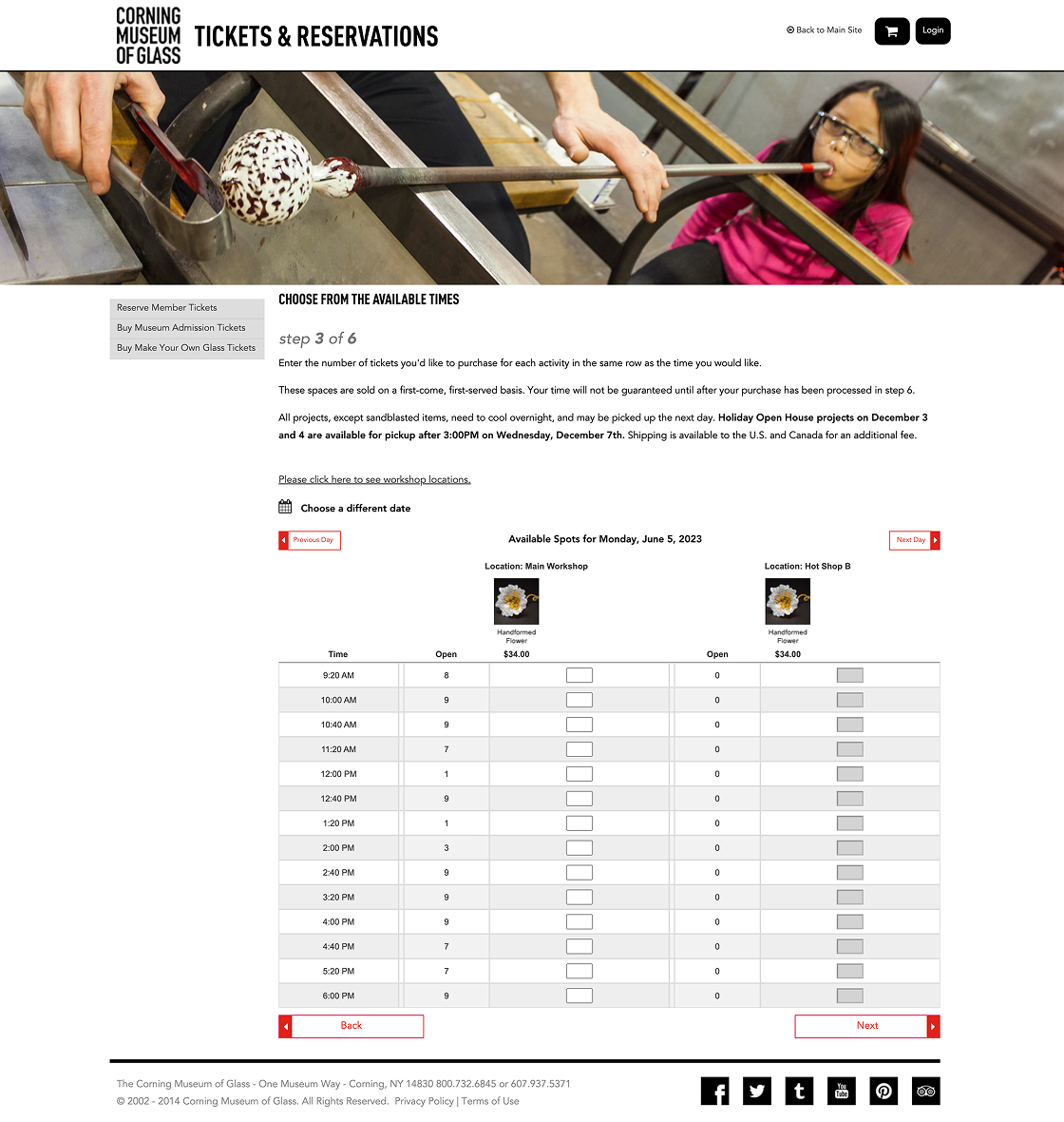
Table-based ticketing interface with dense time slots and horizontal scanning.
Research & Insights
Methods:
Remote and on-site usability testing
A/B testing across multiple flow concepts
Scenario-based testing with families and mixed-age groups
Key Insights:
Users struggled to distinguish museum admission from glassmaking experiences
Age limits, pods (locations), and overlapping schedules caused decision paralysis
Mobile users were disproportionately impacted by dense layouts and tables
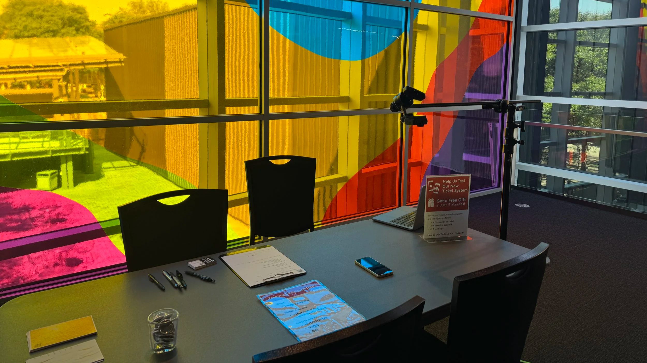
On-site testing, mobile device and camera setup
Remote testing highlighted mobile usability issues
On-site testing, real-time observation & recording
Remote testing highlighted mobile usability issues
Design Approach
Reducing cognitive load by categorizing tickets and experiences
Designing mobile-first, replacing tables with vertical, scroll-based layouts
Using visual structure (tabs, color coding, maps) to clarify constraints without adding text
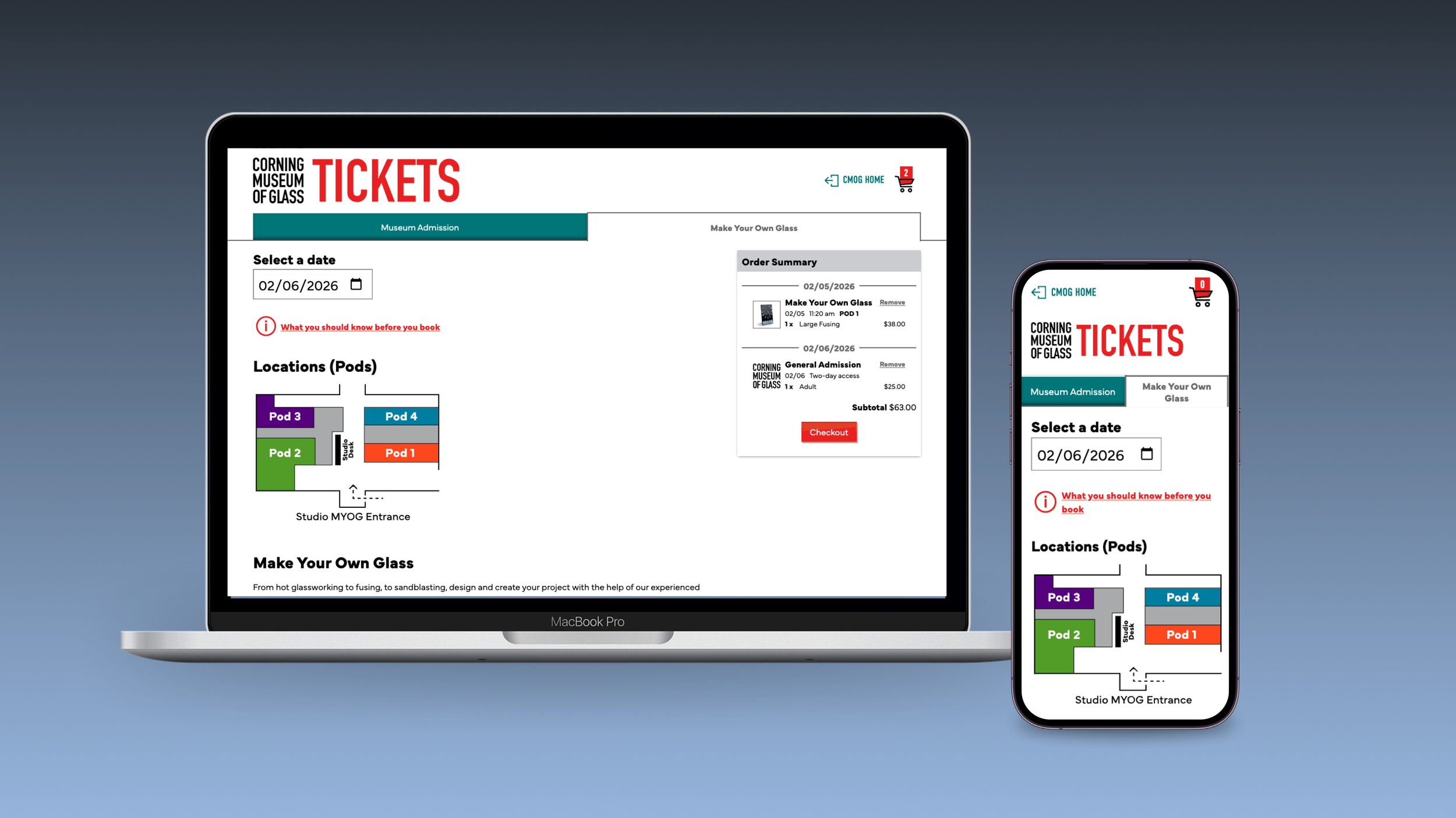
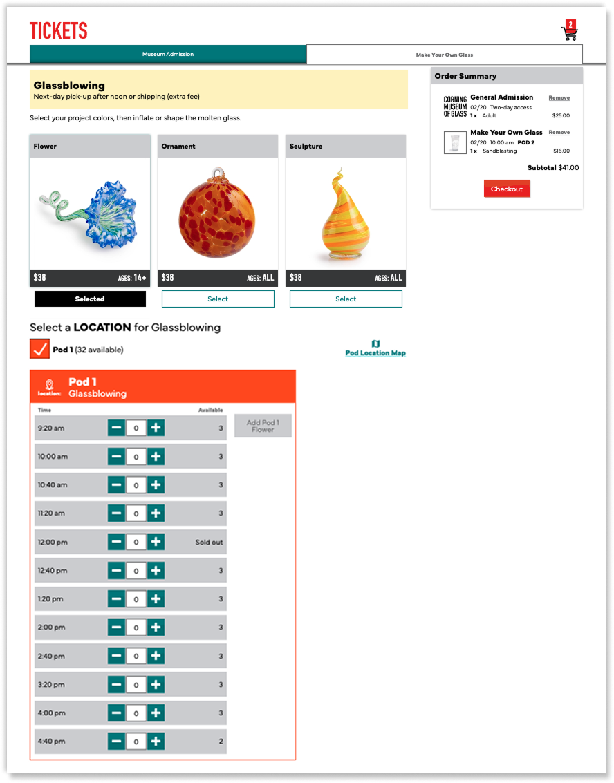
Decision 1 — Separating Admissions and Experiences
Problem
Users could not mentally separate museum entry from hands-on glassmaking classes.Decision
Split Admissions and Make Your Own Glass into two distinct tabs while maintaining a single, continuous page flow.Why It Matters
This clarified intent early, reduced confusion, and helped users plan visits with confidence.
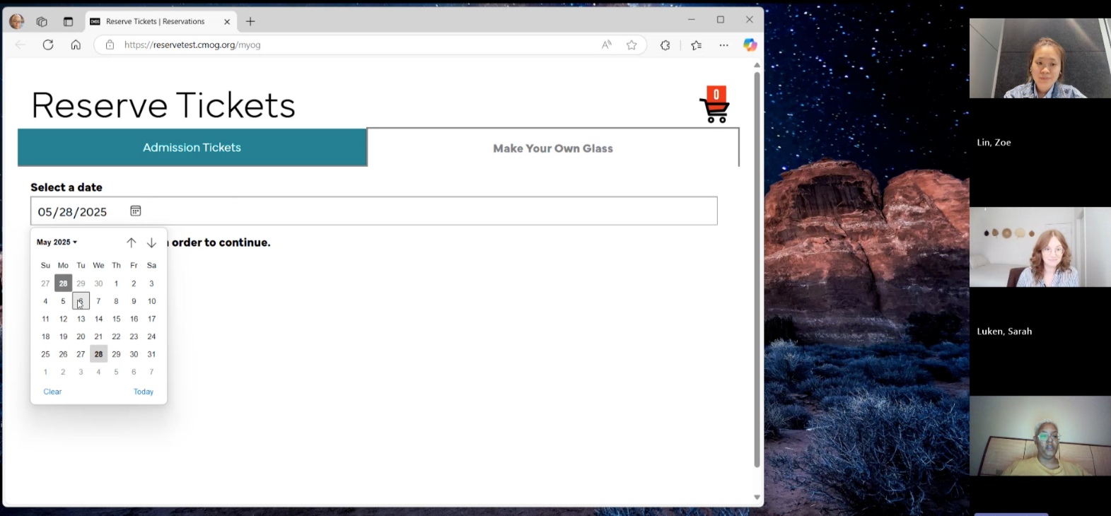
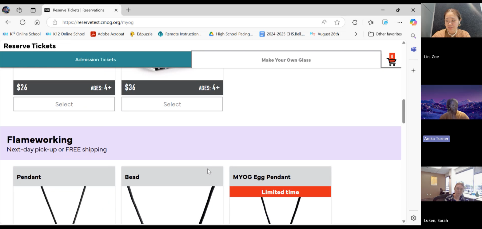
Desktop view — Museum Admission flow separated from experiences
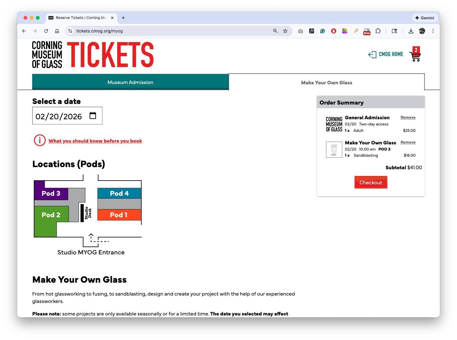
Desktop view — Make Your Own Glass flow with map
Decision 2 — Replacing Tables with a Mobile-first Flow
Problem
The legacy table layout amplified information overload and failed on mobile devices.Decision
Replaced tables with a scroll-based, card-driven layout optimized for mobile, vertical reading.Why It Matters
Enabled on-the-go decision-making and made complex options manageable on small screens.
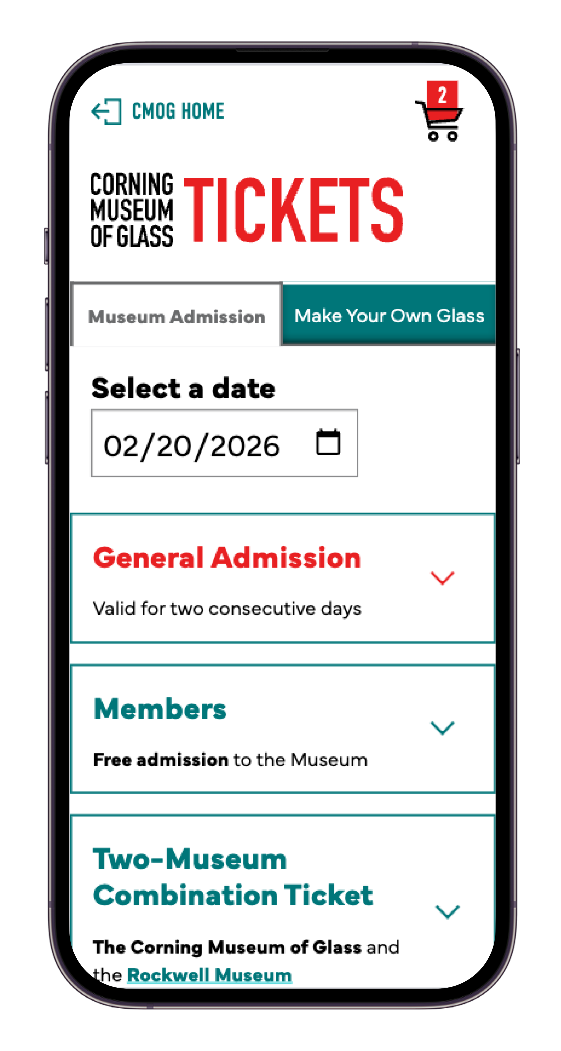
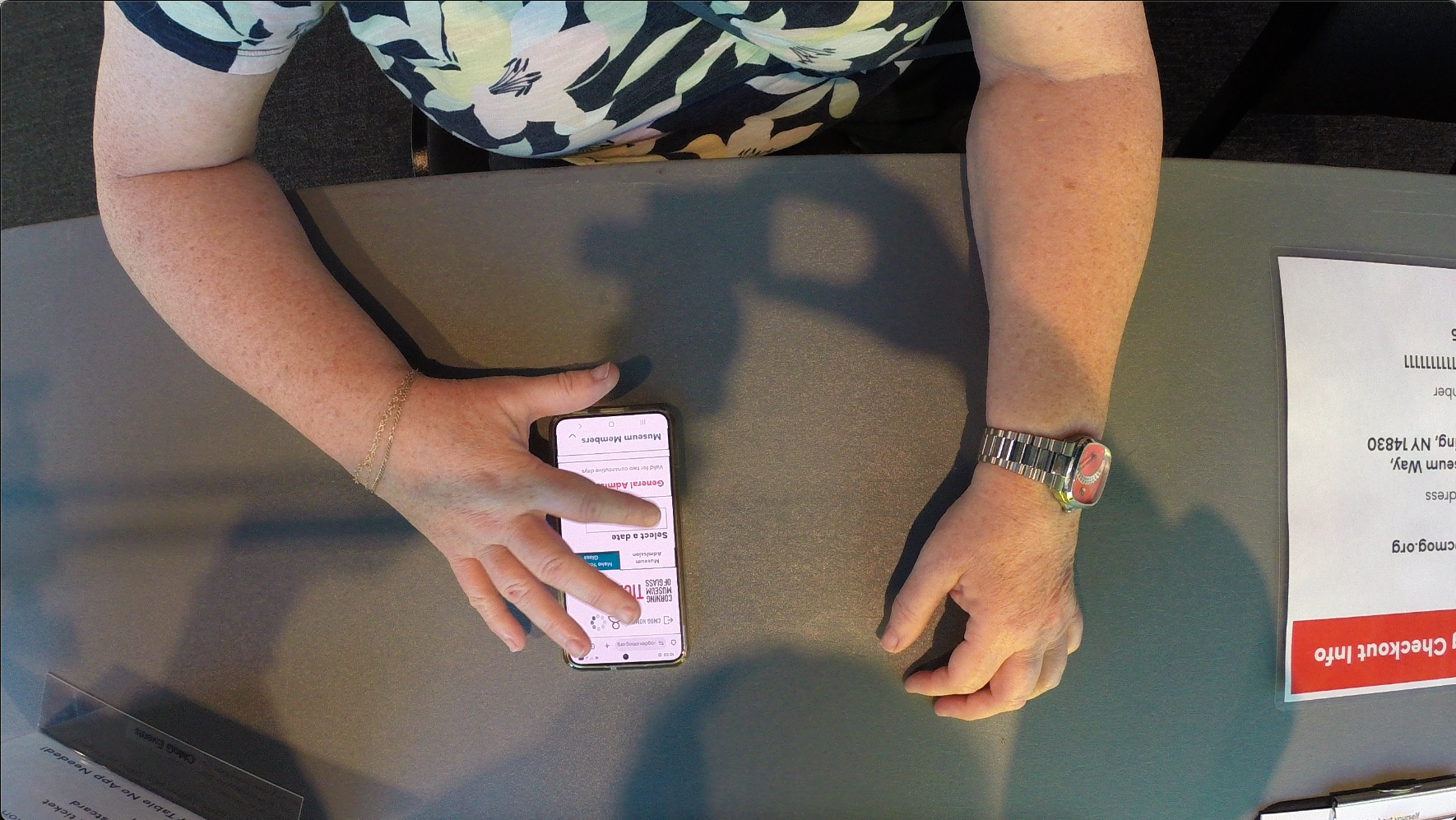
Mobile view — Scroll based Admission ticket selection
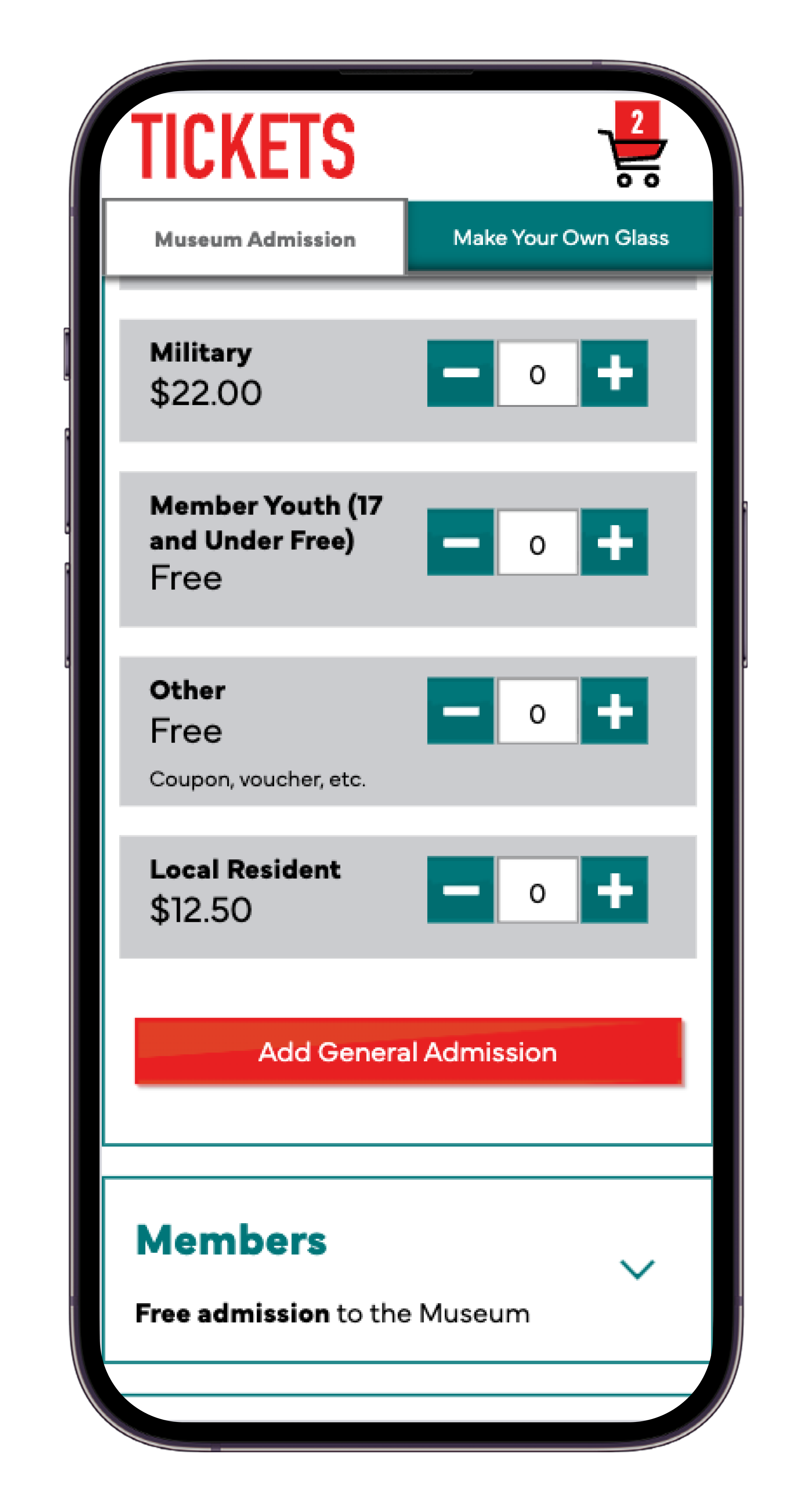
Mobile view — Add Admission ticket to the cart
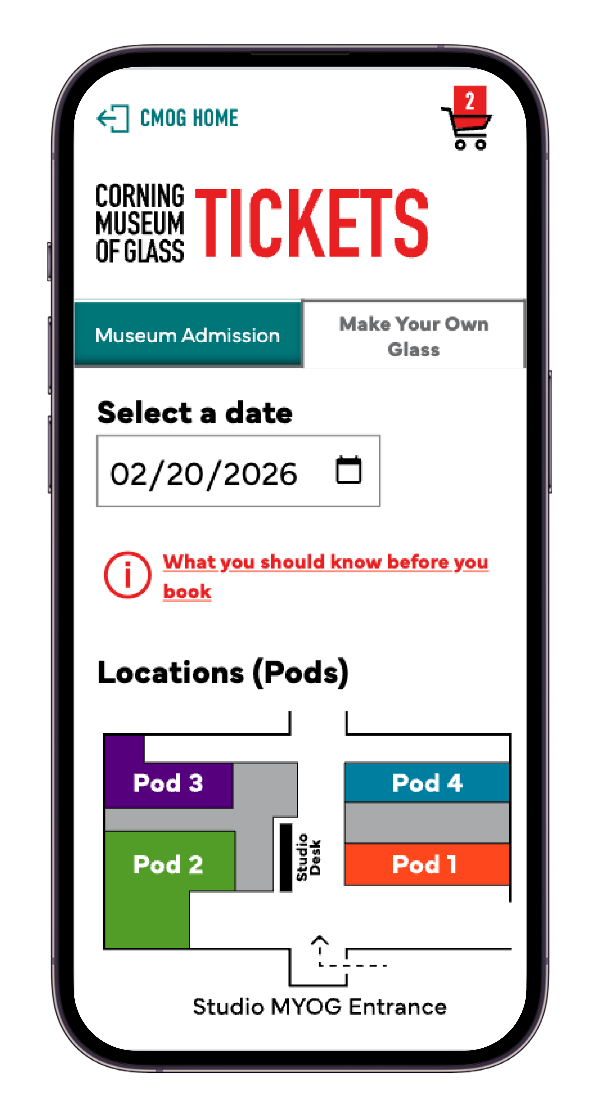
Mobile view — Make Your Own Glass entry point
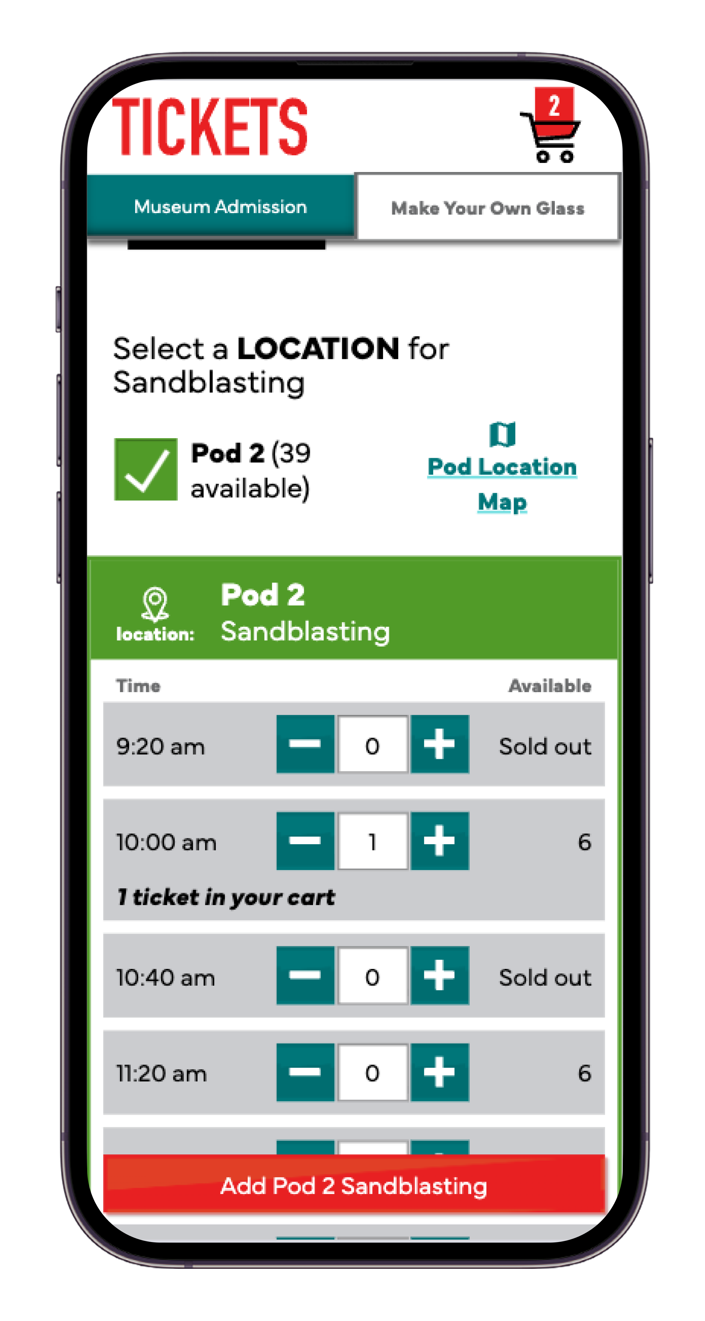
Mobile view — Add MYoG ticket to the cart
Decision 3 — Designing for Operational Constraints Without Exposing Complexity
Problem
Studio operations required tracking seats by pod and project, creating hidden complexity.Decision
Structured flows to show only one pod per project while preserving backend constraints.Why It Matters
Protected users from unnecessary complexity while meeting studio preparation needs.
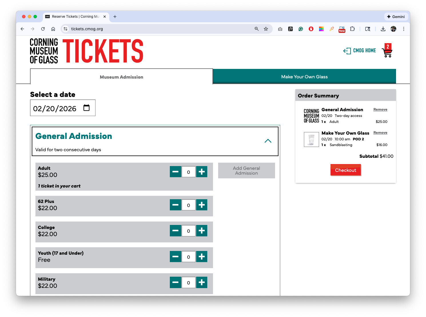
Desktop view — Single-pod seating logic preserved behind the UI
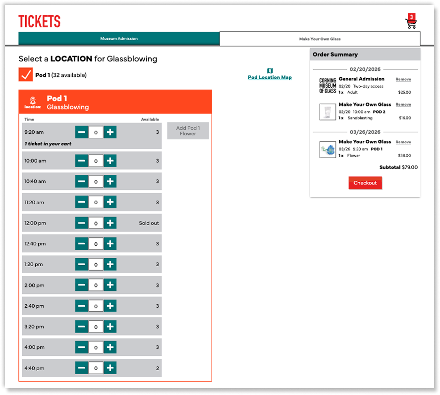
Desktop view — Cart state indicators clarify multi-date selections
Outcome
Launched a redesigned ticketing experience supporting complex reservations
Early heatmap data showed clearer interaction focus and reduced misclicks
Post-launch surveys and additional usability testing are planned to further validate improvements
Reflection & What I learned
This project reinforced how deeply technical constraints and stakeholder requirements shape UX decisions.
Clear communication, early alignment, and deliberate trade-offs were essential to maintaining usability in a highly complex system.
